
Blog chia sẽ kinh nghiệm lập trình và Technical VN. Nơi mà các bạn có thể học tập và tham khảo về những công nghệ mới nhất hiện nay về .NET
Hiển thị các bài đăng có nhãn Template. Hiển thị tất cả bài đăng
Hiển thị các bài đăng có nhãn Template. Hiển thị tất cả bài đăng
Chủ Nhật, 25 tháng 1, 2015
Các trạng thái của TextBox
a) disable
b) normal
c) focus

Đến Mục lục Android UI
TextBox style
[code language="xml"]
<Style TargetType="{x:Type TextBox}">
<Setter Property="SnapsToDevicePixels" Value="True" />
<Setter Property="VerticalContentAlignment" Value="Center" />
<Setter Property="Foreground" Value="#FF272727" />
<Setter Property="FocusVisualStyle" Value="{x:Null}" />
<Setter Property="Template">
<Setter.Value>
<ControlTemplate TargetType="{x:Type TextBoxBase}">
<Border Name="MainBorder" Background="Transparent" CornerRadius="2">
<Grid Margin="4" >
<Grid.ColumnDefinitions>
<ColumnDefinition Width="*" />
<ColumnDefinition Width="Auto" />
</Grid.ColumnDefinitions>
<Border Name="BorderUnderline"
Padding="2"
Margin="0,0,-1,0"
BorderBrush="#808080"
BorderThickness="0,0,0,1">
<ScrollViewer Margin="0" x:Name="PART_ContentHost" />
</Border>
<Path Grid.Column="1"
Name="PathTriangle"
Data="M0,60 L20,60 20,40 z"
Fill="#808080"
Height="15"
Stretch="Fill" Width="15"
VerticalAlignment="Bottom"/>
</Grid>
</Border>
<ControlTemplate.Triggers>
<Trigger Property="IsEnabled" Value="False">
<Setter TargetName="BorderUnderline" Property="BorderBrush" Value="#cccccc" />
<Setter TargetName="PathTriangle" Property="Fill" Value="#cccccc" />
<Setter Property="Foreground" Value="#cccccc" />
</Trigger>
<Trigger Property="IsFocused" Value="True">
<Trigger.EnterActions>
<BeginStoryboard>
<Storyboard>
<ColorAnimation Storyboard.TargetName="MainBorder" Storyboard.TargetProperty="(Border.Background).(SolidColorBrush.Color)"
To="#55029cc7" Duration="0:0:0.3" />
<ColorAnimation Storyboard.TargetName="BorderUnderline" Storyboard.TargetProperty="(Border.BorderBrush).(SolidColorBrush.Color)"
To="#029cc7" Duration="0:0:0.3" />
<ColorAnimation Storyboard.TargetName="PathTriangle" Storyboard.TargetProperty="(Path.Fill).(SolidColorBrush.Color)"
To="#029cc7" Duration="0:0:0.3"/>
</Storyboard>
</BeginStoryboard>
</Trigger.EnterActions>
<Trigger.ExitActions>
<BeginStoryboard>
<Storyboard>
<ColorAnimation Storyboard.TargetName="MainBorder" Storyboard.TargetProperty="(Border.Background).(SolidColorBrush.Color)"
To="Transparent" Duration="0:0:0.3" />
<ColorAnimation Storyboard.TargetName="BorderUnderline" Storyboard.TargetProperty="(Border.BorderBrush).(SolidColorBrush.Color)"
To="#808080" Duration="0:0:0.3" />
<ColorAnimation Storyboard.TargetName="PathTriangle" Storyboard.TargetProperty="(Path.Fill).(SolidColorBrush.Color)"
To="#808080" Duration="0:0:0.3"/>
</Storyboard>
</BeginStoryboard>
</Trigger.ExitActions>
</Trigger>
</ControlTemplate.Triggers>
</ControlTemplate>
</Setter.Value>
</Setter>
</Style>
[/code]
Kết quả

Đến Mục lục Android UI
a) disable
b) normal
c) focus
Đến Mục lục Android UI
TextBox style
[code language="xml"]
<Style TargetType="{x:Type TextBox}">
<Setter Property="SnapsToDevicePixels" Value="True" />
<Setter Property="VerticalContentAlignment" Value="Center" />
<Setter Property="Foreground" Value="#FF272727" />
<Setter Property="FocusVisualStyle" Value="{x:Null}" />
<Setter Property="Template">
<Setter.Value>
<ControlTemplate TargetType="{x:Type TextBoxBase}">
<Border Name="MainBorder" Background="Transparent" CornerRadius="2">
<Grid Margin="4" >
<Grid.ColumnDefinitions>
<ColumnDefinition Width="*" />
<ColumnDefinition Width="Auto" />
</Grid.ColumnDefinitions>
<Border Name="BorderUnderline"
Padding="2"
Margin="0,0,-1,0"
BorderBrush="#808080"
BorderThickness="0,0,0,1">
<ScrollViewer Margin="0" x:Name="PART_ContentHost" />
</Border>
<Path Grid.Column="1"
Name="PathTriangle"
Data="M0,60 L20,60 20,40 z"
Fill="#808080"
Height="15"
Stretch="Fill" Width="15"
VerticalAlignment="Bottom"/>
</Grid>
</Border>
<ControlTemplate.Triggers>
<Trigger Property="IsEnabled" Value="False">
<Setter TargetName="BorderUnderline" Property="BorderBrush" Value="#cccccc" />
<Setter TargetName="PathTriangle" Property="Fill" Value="#cccccc" />
<Setter Property="Foreground" Value="#cccccc" />
</Trigger>
<Trigger Property="IsFocused" Value="True">
<Trigger.EnterActions>
<BeginStoryboard>
<Storyboard>
<ColorAnimation Storyboard.TargetName="MainBorder" Storyboard.TargetProperty="(Border.Background).(SolidColorBrush.Color)"
To="#55029cc7" Duration="0:0:0.3" />
<ColorAnimation Storyboard.TargetName="BorderUnderline" Storyboard.TargetProperty="(Border.BorderBrush).(SolidColorBrush.Color)"
To="#029cc7" Duration="0:0:0.3" />
<ColorAnimation Storyboard.TargetName="PathTriangle" Storyboard.TargetProperty="(Path.Fill).(SolidColorBrush.Color)"
To="#029cc7" Duration="0:0:0.3"/>
</Storyboard>
</BeginStoryboard>
</Trigger.EnterActions>
<Trigger.ExitActions>
<BeginStoryboard>
<Storyboard>
<ColorAnimation Storyboard.TargetName="MainBorder" Storyboard.TargetProperty="(Border.Background).(SolidColorBrush.Color)"
To="Transparent" Duration="0:0:0.3" />
<ColorAnimation Storyboard.TargetName="BorderUnderline" Storyboard.TargetProperty="(Border.BorderBrush).(SolidColorBrush.Color)"
To="#808080" Duration="0:0:0.3" />
<ColorAnimation Storyboard.TargetName="PathTriangle" Storyboard.TargetProperty="(Path.Fill).(SolidColorBrush.Color)"
To="#808080" Duration="0:0:0.3"/>
</Storyboard>
</BeginStoryboard>
</Trigger.ExitActions>
</Trigger>
</ControlTemplate.Triggers>
</ControlTemplate>
</Setter.Value>
</Setter>
</Style>
[/code]
Kết quả
Đến Mục lục Android UI
Các trạng thái của RadioButton
a) normal
b) focused
c) indeterminate
d) checked
e) checked, disabled

Đến Mục lục Android UI
RadioButton style
[code language="xml"]
<Style x:Key="RadioButtonStyle" TargetType="RadioButton">
<Setter Property="SnapsToDevicePixels" Value="true" />
<Setter Property="OverridesDefaultStyle" Value="true" />
<Setter Property="BorderThickness" Value="1" />
<Setter Property="Height" Value="20" />
<Setter Property="Margin" Value="5" />
<Setter Property="FocusVisualStyle" Value="{x:Null}" />
<Setter Property="Template">
<Setter.Value>
<ControlTemplate TargetType="RadioButton">
<BulletDecorator>
<BulletDecorator.Bullet>
<Grid Height="{TemplateBinding Height}" Width="{Binding RelativeSource={RelativeSource Self}, Path=Height, UpdateSourceTrigger=PropertyChanged}"
MinHeight="20" MinWidth="20">
<Grid.ColumnDefinitions>
<ColumnDefinition Width="1*" />
<ColumnDefinition Width="3*" />
<ColumnDefinition Width="1*" />
</Grid.ColumnDefinitions>
<Grid.RowDefinitions>
<RowDefinition Height="1*" />
<RowDefinition Height="3*" />
<RowDefinition Height="1*" />
</Grid.RowDefinitions>
<Ellipse Name="EllipseMain"
Grid.Column="0" Grid.ColumnSpan="3"
Grid.Row="0" Grid.RowSpan="3"
Fill="Transparent"
StrokeThickness="{TemplateBinding BorderThickness}"
Stroke="DimGray" />
<Ellipse Name="CheckMark"
Grid.Column="1"
Grid.Row="1"
Opacity="0"
Fill="#029cc7" />
</Grid>
</BulletDecorator.Bullet>
<VisualStateManager.VisualStateGroups>
<VisualStateGroup x:Name="CommonStates">
<VisualState x:Name="Disabled">
<Storyboard>
<ColorAnimation Storyboard.TargetName="CheckMark" Storyboard.TargetProperty="(Ellipse.Fill).(SolidColorBrush.Color)"
To="LightGray" Duration="0:0:0.3" />
<ColorAnimation Storyboard.TargetName="EllipseMain" Storyboard.TargetProperty="(Ellipse.Stroke).(SolidColorBrush.Color)"
To="LightGray" Duration="0:0:0.3" />
</Storyboard>
</VisualState>
</VisualStateGroup>
<VisualStateGroup x:Name="CheckStates">
<VisualState x:Name="Checked">
<Storyboard>
<DoubleAnimation Storyboard.TargetName="CheckMark" Storyboard.TargetProperty="Opacity"
To="1" Duration="0:0:0.3" />
</Storyboard>
</VisualState>
<VisualState x:Name="Unchecked" >
<Storyboard>
<DoubleAnimation Storyboard.TargetName="CheckMark" Storyboard.TargetProperty="Opacity"
To="0" Duration="0:0:0.3" />
</Storyboard>
</VisualState>
<VisualState x:Name="Indeterminate" >
<Storyboard>
<DoubleAnimation Storyboard.TargetName="CheckMark" Storyboard.TargetProperty="Opacity"
To="1" Duration="0:0:0.3" />
<ColorAnimation Storyboard.TargetName="CheckMark" Storyboard.TargetProperty="(Ellipse.Fill).(SolidColorBrush.Color)"
To="Gray" Duration="0:0:0.3" />
</Storyboard>
</VisualState>
</VisualStateGroup>
</VisualStateManager.VisualStateGroups>
<ContentPresenter Margin="4,0,0,0"
HorizontalAlignment="Left"
VerticalAlignment="Center"
RecognizesAccessKey="True" />
</BulletDecorator>
<ControlTemplate.Triggers>
<Trigger Property="IsPressed" Value="True">
<Setter TargetName="EllipseMain" Property="Fill" Value="#55029cc7" />
</Trigger>
<Trigger Property="IsFocused" Value="True">
<Setter TargetName="EllipseMain" Property="Stroke" Value="#88029cc7" />
</Trigger>
</ControlTemplate.Triggers>
</ControlTemplate>
</Setter.Value>
</Setter>
</Style>
[/code]
Cách dùng
[code language="xml"]
<!-- Bạn có thể thoải mái tùy chỉnh kích thước -->
<RadioButton Style="{StaticResource RadioButtonStyle}" Content="" Height="30" />
[/code]
Kết quả
Đến Mục lục Android UI
a) normal
b) focused
c) indeterminate
d) checked
e) checked, disabled
Đến Mục lục Android UI
RadioButton style
[code language="xml"]
<Style x:Key="RadioButtonStyle" TargetType="RadioButton">
<Setter Property="SnapsToDevicePixels" Value="true" />
<Setter Property="OverridesDefaultStyle" Value="true" />
<Setter Property="BorderThickness" Value="1" />
<Setter Property="Height" Value="20" />
<Setter Property="Margin" Value="5" />
<Setter Property="FocusVisualStyle" Value="{x:Null}" />
<Setter Property="Template">
<Setter.Value>
<ControlTemplate TargetType="RadioButton">
<BulletDecorator>
<BulletDecorator.Bullet>
<Grid Height="{TemplateBinding Height}" Width="{Binding RelativeSource={RelativeSource Self}, Path=Height, UpdateSourceTrigger=PropertyChanged}"
MinHeight="20" MinWidth="20">
<Grid.ColumnDefinitions>
<ColumnDefinition Width="1*" />
<ColumnDefinition Width="3*" />
<ColumnDefinition Width="1*" />
</Grid.ColumnDefinitions>
<Grid.RowDefinitions>
<RowDefinition Height="1*" />
<RowDefinition Height="3*" />
<RowDefinition Height="1*" />
</Grid.RowDefinitions>
<Ellipse Name="EllipseMain"
Grid.Column="0" Grid.ColumnSpan="3"
Grid.Row="0" Grid.RowSpan="3"
Fill="Transparent"
StrokeThickness="{TemplateBinding BorderThickness}"
Stroke="DimGray" />
<Ellipse Name="CheckMark"
Grid.Column="1"
Grid.Row="1"
Opacity="0"
Fill="#029cc7" />
</Grid>
</BulletDecorator.Bullet>
<VisualStateManager.VisualStateGroups>
<VisualStateGroup x:Name="CommonStates">
<VisualState x:Name="Disabled">
<Storyboard>
<ColorAnimation Storyboard.TargetName="CheckMark" Storyboard.TargetProperty="(Ellipse.Fill).(SolidColorBrush.Color)"
To="LightGray" Duration="0:0:0.3" />
<ColorAnimation Storyboard.TargetName="EllipseMain" Storyboard.TargetProperty="(Ellipse.Stroke).(SolidColorBrush.Color)"
To="LightGray" Duration="0:0:0.3" />
</Storyboard>
</VisualState>
</VisualStateGroup>
<VisualStateGroup x:Name="CheckStates">
<VisualState x:Name="Checked">
<Storyboard>
<DoubleAnimation Storyboard.TargetName="CheckMark" Storyboard.TargetProperty="Opacity"
To="1" Duration="0:0:0.3" />
</Storyboard>
</VisualState>
<VisualState x:Name="Unchecked" >
<Storyboard>
<DoubleAnimation Storyboard.TargetName="CheckMark" Storyboard.TargetProperty="Opacity"
To="0" Duration="0:0:0.3" />
</Storyboard>
</VisualState>
<VisualState x:Name="Indeterminate" >
<Storyboard>
<DoubleAnimation Storyboard.TargetName="CheckMark" Storyboard.TargetProperty="Opacity"
To="1" Duration="0:0:0.3" />
<ColorAnimation Storyboard.TargetName="CheckMark" Storyboard.TargetProperty="(Ellipse.Fill).(SolidColorBrush.Color)"
To="Gray" Duration="0:0:0.3" />
</Storyboard>
</VisualState>
</VisualStateGroup>
</VisualStateManager.VisualStateGroups>
<ContentPresenter Margin="4,0,0,0"
HorizontalAlignment="Left"
VerticalAlignment="Center"
RecognizesAccessKey="True" />
</BulletDecorator>
<ControlTemplate.Triggers>
<Trigger Property="IsPressed" Value="True">
<Setter TargetName="EllipseMain" Property="Fill" Value="#55029cc7" />
</Trigger>
<Trigger Property="IsFocused" Value="True">
<Setter TargetName="EllipseMain" Property="Stroke" Value="#88029cc7" />
</Trigger>
</ControlTemplate.Triggers>
</ControlTemplate>
</Setter.Value>
</Setter>
</Style>
[/code]
Cách dùng
[code language="xml"]
<!-- Bạn có thể thoải mái tùy chỉnh kích thước -->
<RadioButton Style="{StaticResource RadioButtonStyle}" Content="" Height="30" />
[/code]
Kết quả
Đến Mục lục Android UI
Các trạng thái của TabControl
Tab1) normal
Tab2) focus (selected)
Tab3) tab (keyboard) focus
Tab4) disabled

Đến Mục lục Android UI
[code language="xml"]
<Style x:Key="TabControlStyle" TargetType="{x:Type TabControl}">
<Setter Property="OverridesDefaultStyle" Value="True" />
<Setter Property="SnapsToDevicePixels" Value="True" />
<Setter Property="Template">
<Setter.Value>
<ControlTemplate TargetType="{x:Type TabControl}">
<Grid KeyboardNavigation.TabNavigation="Local">
<Grid.RowDefinitions>
<RowDefinition Height="Auto" />
<RowDefinition Height="*" />
</Grid.RowDefinitions>
<TabPanel x:Name="HeaderPanel"
Grid.Row="0"
Panel.ZIndex="1"
Margin="0,0,4,-1"
IsItemsHost="True"
KeyboardNavigation.TabIndex="1"
Background="Transparent" />
<Border x:Name="Border"
Grid.Row="1"
BorderThickness="2"
CornerRadius="2"
KeyboardNavigation.TabNavigation="Local"
KeyboardNavigation.DirectionalNavigation="Contained"
KeyboardNavigation.TabIndex="2"
BorderBrush="LightGray">
<ContentPresenter x:Name="PART_SelectedContentHost" Margin="4" ContentSource="SelectedContent" />
</Border>
</Grid>
</ControlTemplate>
</Setter.Value>
</Setter>
</Style>
[/code]
TabItem style
[code language="xml"]
<Style x:Key="TabItemStyle" TargetType="{x:Type TabItem}">
<Setter Property="FontSize" Value="12"/>
<Setter Property="FontWeight" Value="Bold"/>
<Setter Property="Foreground" Value="#FF474747"/>
<Setter Property="FocusVisualStyle" Value="{StaticResource dgFocusVisualStyte}" />
<Setter Property="Template">
<Setter.Value>
<ControlTemplate TargetType="{x:Type TabItem}">
<ControlTemplate.Resources>
<Storyboard x:Key="StartAction">
<DoubleAnimation Storyboard.TargetName="Border1Highlited" Storyboard.TargetProperty="(UIElement.Opacity)" From="0" To="1" Duration="0:0:0.5"/>
<DoubleAnimation Storyboard.TargetName="Border2Highlited" Storyboard.TargetProperty="(UIElement.Opacity)" From="0" To="1" Duration="0:0:0.5"/>
</Storyboard>
<Storyboard x:Key="ExitAction">
<DoubleAnimation Storyboard.TargetName="Border1Highlited" Storyboard.TargetProperty="Opacity" From="1" To="0" Duration="0:0:0.3" />
<DoubleAnimation Storyboard.TargetName="Border2Highlited" Storyboard.TargetProperty="Opacity" From="1" To="0" Duration="0:0:0.3" />
</Storyboard>
</ControlTemplate.Resources>
<Grid x:Name="Root">
<Grid.ColumnDefinitions>
<ColumnDefinition Width="*" />
<ColumnDefinition Width="1" />
</Grid.ColumnDefinitions>
<Grid.RowDefinitions>
<RowDefinition Height="*" />
<RowDefinition Height="6" />
<RowDefinition Height="2" />
</Grid.RowDefinitions>
<Border x:Name="Border" Margin="0,0,-1,0" Background="#ededed">
<ContentPresenter x:Name="ContentSite"
VerticalAlignment="Center"
HorizontalAlignment="Center"
ContentSource="Header"
Margin="30,10,30,4"
RecognizesAccessKey="True" />
</Border>
<Border Grid.Column="1" Margin="0,10,0,4" Background="#d6d6d6" />
<Border Grid.Row="1" Grid.ColumnSpan="2" Background="#ededed"/>
<Border Grid.Row="1" Grid.ColumnSpan="2" Name="Border1Highlited" Background="Transparent"/>
<Border Grid.Row="2" Grid.ColumnSpan="2" Background="#c9c9c9"/>
<Border Grid.Row="2" Grid.ColumnSpan="2" Name="Border2Highlited" Background="Transparent"/>
</Grid>
<ControlTemplate.Triggers>
<Trigger Property="IsSelected" Value="True">
<Setter Property="Panel.ZIndex" Value="100" />
<Setter TargetName="Border1Highlited" Property="Background" Value="#33b4ed" />
<Setter TargetName="Border2Highlited" Property="Background" Value="#009de2" />
<Trigger.EnterActions>
<BeginStoryboard Storyboard="{StaticResource StartAction}"/>
</Trigger.EnterActions>
<Trigger.ExitActions>
<BeginStoryboard Storyboard="{StaticResource ExitAction}"/>
</Trigger.ExitActions>
</Trigger>
<Trigger Property="IsEnabled" Value="False">
<Setter Property="Foreground" Value="#cccccc" />
</Trigger>
</ControlTemplate.Triggers>
</ControlTemplate>
</Setter.Value>
</Setter>
</Style>
[/code]
FocusVisual Style
[code language="xml"]
<Style x:Key="dgFocusVisualStyte" >
<Setter Property="Control.Template">
<Setter.Value>
<ControlTemplate>
<Border x:Name="FocusStyle" Background="#4433b4ed" />
</ControlTemplate>
</Setter.Value>
</Setter>
</Style>
[/code]
Cách sử dụng
[code language="xml"]
<TabControl Style="{StaticResource TabControlStyle}" Margin="10">
<TabItem Style="{StaticResource TabItemStyle}" Header="Tab1">tab1</TabItem>
<TabItem Style="{StaticResource TabItemStyle}" Header="Tab2">tab2</TabItem>
<TabItem Style="{StaticResource TabItemStyle}" Header="Tab3">tab3</TabItem>
<TabItem Style="{StaticResource TabItemStyle}" Header="Tab4" IsEnabled="False">tab4</TabItem>
</TabControl>
[/code]
Kết quả

Đến Mục lục Android UI
Tab1) normal
Tab2) focus (selected)
Tab3) tab (keyboard) focus
Tab4) disabled
Đến Mục lục Android UI
TabControl style
[code language="xml"]
<Style x:Key="TabControlStyle" TargetType="{x:Type TabControl}">
<Setter Property="OverridesDefaultStyle" Value="True" />
<Setter Property="SnapsToDevicePixels" Value="True" />
<Setter Property="Template">
<Setter.Value>
<ControlTemplate TargetType="{x:Type TabControl}">
<Grid KeyboardNavigation.TabNavigation="Local">
<Grid.RowDefinitions>
<RowDefinition Height="Auto" />
<RowDefinition Height="*" />
</Grid.RowDefinitions>
<TabPanel x:Name="HeaderPanel"
Grid.Row="0"
Panel.ZIndex="1"
Margin="0,0,4,-1"
IsItemsHost="True"
KeyboardNavigation.TabIndex="1"
Background="Transparent" />
<Border x:Name="Border"
Grid.Row="1"
BorderThickness="2"
CornerRadius="2"
KeyboardNavigation.TabNavigation="Local"
KeyboardNavigation.DirectionalNavigation="Contained"
KeyboardNavigation.TabIndex="2"
BorderBrush="LightGray">
<ContentPresenter x:Name="PART_SelectedContentHost" Margin="4" ContentSource="SelectedContent" />
</Border>
</Grid>
</ControlTemplate>
</Setter.Value>
</Setter>
</Style>
[/code]
TabItem style
[code language="xml"]
<Style x:Key="TabItemStyle" TargetType="{x:Type TabItem}">
<Setter Property="FontSize" Value="12"/>
<Setter Property="FontWeight" Value="Bold"/>
<Setter Property="Foreground" Value="#FF474747"/>
<Setter Property="FocusVisualStyle" Value="{StaticResource dgFocusVisualStyte}" />
<Setter Property="Template">
<Setter.Value>
<ControlTemplate TargetType="{x:Type TabItem}">
<ControlTemplate.Resources>
<Storyboard x:Key="StartAction">
<DoubleAnimation Storyboard.TargetName="Border1Highlited" Storyboard.TargetProperty="(UIElement.Opacity)" From="0" To="1" Duration="0:0:0.5"/>
<DoubleAnimation Storyboard.TargetName="Border2Highlited" Storyboard.TargetProperty="(UIElement.Opacity)" From="0" To="1" Duration="0:0:0.5"/>
</Storyboard>
<Storyboard x:Key="ExitAction">
<DoubleAnimation Storyboard.TargetName="Border1Highlited" Storyboard.TargetProperty="Opacity" From="1" To="0" Duration="0:0:0.3" />
<DoubleAnimation Storyboard.TargetName="Border2Highlited" Storyboard.TargetProperty="Opacity" From="1" To="0" Duration="0:0:0.3" />
</Storyboard>
</ControlTemplate.Resources>
<Grid x:Name="Root">
<Grid.ColumnDefinitions>
<ColumnDefinition Width="*" />
<ColumnDefinition Width="1" />
</Grid.ColumnDefinitions>
<Grid.RowDefinitions>
<RowDefinition Height="*" />
<RowDefinition Height="6" />
<RowDefinition Height="2" />
</Grid.RowDefinitions>
<Border x:Name="Border" Margin="0,0,-1,0" Background="#ededed">
<ContentPresenter x:Name="ContentSite"
VerticalAlignment="Center"
HorizontalAlignment="Center"
ContentSource="Header"
Margin="30,10,30,4"
RecognizesAccessKey="True" />
</Border>
<Border Grid.Column="1" Margin="0,10,0,4" Background="#d6d6d6" />
<Border Grid.Row="1" Grid.ColumnSpan="2" Background="#ededed"/>
<Border Grid.Row="1" Grid.ColumnSpan="2" Name="Border1Highlited" Background="Transparent"/>
<Border Grid.Row="2" Grid.ColumnSpan="2" Background="#c9c9c9"/>
<Border Grid.Row="2" Grid.ColumnSpan="2" Name="Border2Highlited" Background="Transparent"/>
</Grid>
<ControlTemplate.Triggers>
<Trigger Property="IsSelected" Value="True">
<Setter Property="Panel.ZIndex" Value="100" />
<Setter TargetName="Border1Highlited" Property="Background" Value="#33b4ed" />
<Setter TargetName="Border2Highlited" Property="Background" Value="#009de2" />
<Trigger.EnterActions>
<BeginStoryboard Storyboard="{StaticResource StartAction}"/>
</Trigger.EnterActions>
<Trigger.ExitActions>
<BeginStoryboard Storyboard="{StaticResource ExitAction}"/>
</Trigger.ExitActions>
</Trigger>
<Trigger Property="IsEnabled" Value="False">
<Setter Property="Foreground" Value="#cccccc" />
</Trigger>
</ControlTemplate.Triggers>
</ControlTemplate>
</Setter.Value>
</Setter>
</Style>
[/code]
FocusVisual Style
[code language="xml"]
<Style x:Key="dgFocusVisualStyte" >
<Setter Property="Control.Template">
<Setter.Value>
<ControlTemplate>
<Border x:Name="FocusStyle" Background="#4433b4ed" />
</ControlTemplate>
</Setter.Value>
</Setter>
</Style>
[/code]
Cách sử dụng
[code language="xml"]
<TabControl Style="{StaticResource TabControlStyle}" Margin="10">
<TabItem Style="{StaticResource TabItemStyle}" Header="Tab1">tab1</TabItem>
<TabItem Style="{StaticResource TabItemStyle}" Header="Tab2">tab2</TabItem>
<TabItem Style="{StaticResource TabItemStyle}" Header="Tab3">tab3</TabItem>
<TabItem Style="{StaticResource TabItemStyle}" Header="Tab4" IsEnabled="False">tab4</TabItem>
</TabControl>
[/code]
Kết quả
Đến Mục lục Android UI
Các trạng thái của Slider
Slider normal
Slider when onMouseOver
Slider when disable
Slider tab focus
Các thành phần của Slider
Đến Mục lục Android UI


Slider style
[code language="xml"]
<Style x:Key="SliderStyle" TargetType="{x:Type Slider}">
<Setter Property="FocusVisualStyle" Value="{StaticResource dgFocusVisualStyte}" />
<Setter Property="SnapsToDevicePixels" Value="true" />
<Setter Property="OverridesDefaultStyle" Value="true" />
<Style.Triggers>
<Trigger Property="Orientation" Value="Horizontal">
<Setter Property="MinWidth" Value="104" />
<Setter Property="MinHeight" Value="21" />
<Setter Property="Template" Value="{StaticResource HorizontalSlider}" />
</Trigger>
<Trigger Property="Orientation" Value="Vertical">
<Setter Property="MinWidth" Value="21" />
<Setter Property="MinHeight" Value="104" />
<Setter Property="Template" Value="{StaticResource VerticalSlider}" />
</Trigger>
</Style.Triggers>
</Style>
[/code]
Vertical slider template
[code language="xml"]
<ControlTemplate x:Key="VerticalSlider" TargetType="{x:Type Slider}">
<Grid Margin="5">
<Grid.ColumnDefinitions>
<ColumnDefinition Width="Auto" />
<ColumnDefinition Width="Auto" MinWidth="{TemplateBinding MinWidth}"/>
<ColumnDefinition Width="Auto"/>
</Grid.ColumnDefinitions>
<TickBar x:Name="TopTick" Visibility="Collapsed" Fill="LightGray" Placement="Left" SnapsToDevicePixels="True"
Width="4" Margin="0,0,2,0" />
<Border x:Name="TrackBackground"
Grid.Column="1"
Margin="0,10"
BorderThickness="2"
BorderBrush="LightGray"
HorizontalAlignment="Center" Width="4" />
<Track x:Name="PART_Track" Grid.Column="1">
<Track.DecreaseRepeatButton>
<RepeatButton Command="{x:Static Slider.DecreaseLarge}" Style="{StaticResource SliderRepeatButtonStyle}" />
</Track.DecreaseRepeatButton>
<Track.IncreaseRepeatButton>
<RepeatButton Command="{x:Static Slider.IncreaseLarge}" Style="{StaticResource SliderRepeatButtonStyle}"/>
</Track.IncreaseRepeatButton>
<Track.Thumb>
<Thumb x:Name="Thumb" Style="{StaticResource SliderThumbStyle}" />
</Track.Thumb>
</Track>
<TickBar x:Name="BottomTick" Grid.Column="2" Visibility="Collapsed" Fill="LightGray" Placement="Right"
Width="4" Margin="2,0,0,0" SnapsToDevicePixels="True" />
</Grid>
<ControlTemplate.Triggers>
<Trigger Property="TickPlacement" Value="TopLeft">
<Setter TargetName="TopTick" Property="Visibility" Value="Visible" />
</Trigger>
<Trigger Property="TickPlacement" Value="BottomRight">
<Setter TargetName="BottomTick" Property="Visibility" Value="Visible" />
</Trigger>
<Trigger Property="TickPlacement" Value="Both">
<Setter TargetName="TopTick" Property="Visibility" Value="Visible" />
<Setter TargetName="BottomTick" Property="Visibility" Value="Visible" />
</Trigger>
</ControlTemplate.Triggers>
</ControlTemplate>
[/code]
Horizontal slider template
[code language="xml"]
<ControlTemplate x:Key="HorizontalSlider" TargetType="{x:Type Slider}">
<Grid Margin="5">
<Grid.RowDefinitions>
<RowDefinition Height="Auto" />
<RowDefinition Height="Auto" MinHeight="{TemplateBinding MinHeight}"/>
<RowDefinition Height="Auto"/>
</Grid.RowDefinitions>
<TickBar x:Name="TopTick" Visibility="Collapsed" Fill="LightGray" Placement="Top" SnapsToDevicePixels="True"
Height="4" Margin="0,0,0,2" />
<Border x:Name="TrackBackground"
Grid.Row="1"
Margin="10,0"
BorderThickness="2"
BorderBrush="LightGray"
VerticalAlignment="Center" Height="4" />
<Track x:Name="PART_Track" Grid.Row="1">
<Track.DecreaseRepeatButton>
<RepeatButton Command="{x:Static Slider.DecreaseLarge}" Style="{StaticResource SliderRepeatButtonStyle}" />
</Track.DecreaseRepeatButton>
<Track.IncreaseRepeatButton>
<RepeatButton Command="{x:Static Slider.IncreaseLarge}" Style="{StaticResource SliderRepeatButtonStyle}"/>
</Track.IncreaseRepeatButton>
<Track.Thumb>
<Thumb x:Name="Thumb" Style="{StaticResource SliderThumbStyle}" />
</Track.Thumb>
</Track>
<TickBar x:Name="BottomTick" Grid.Row="2" Visibility="Collapsed" Fill="LightGray" Placement="Bottom"
SnapsToDevicePixels="True" Height="4" Margin="0,2,0,0"/>
</Grid>
<ControlTemplate.Triggers>
<Trigger Property="TickPlacement" Value="TopLeft">
<Setter TargetName="TopTick" Property="Visibility" Value="Visible" />
</Trigger>
<Trigger Property="TickPlacement" Value="BottomRight">
<Setter TargetName="BottomTick" Property="Visibility" Value="Visible" />
</Trigger>
<Trigger Property="TickPlacement" Value="Both">
<Setter TargetName="TopTick" Property="Visibility" Value="Visible" />
<Setter TargetName="BottomTick" Property="Visibility" Value="Visible" />
</Trigger>
</ControlTemplate.Triggers>
</ControlTemplate>
[/code]
RepeatButton style
[code language="xml"]
<Style x:Key="SliderRepeatButtonStyle" TargetType="{x:Type RepeatButton}">
<Setter Property="OverridesDefaultStyle" Value="true"/>
<Setter Property="IsTabStop" Value="false"/>
<Setter Property="Focusable" Value="false"/>
<Setter Property="Template">
<Setter.Value>
<ControlTemplate TargetType="{x:Type RepeatButton}">
<Rectangle Fill="Transparent"/>
</ControlTemplate>
</Setter.Value>
</Setter>
</Style>
[/code]
Thumb style
[code language="xml"]
<Style x:Key="SliderThumbStyle" TargetType="{x:Type Thumb}">
<Setter Property="OverridesDefaultStyle" Value="True"/>
<Setter Property="Template">
<Setter.Value>
<ControlTemplate TargetType="{x:Type Thumb}">
<Grid>
<Border Name="outerBorder"
Background="#5534b4e3"
BorderBrush="#5534b4e3"
Height="26" Width="26" Opacity="1" BorderThickness="2" CornerRadius="13"/>
<Border Name="innerBorder"
Background="#FF34b4e3"
BorderBrush="#FF34b4e3"
Height="10" Width="10" CornerRadius="5" Opacity="1" />
</Grid>
<ControlTemplate.Triggers>
<Trigger Property="IsMouseOver" Value="True">
<Setter TargetName="outerBorder" Property="BorderBrush" Value="#BB34b4e3" />
</Trigger>
<Trigger Property="IsEnabled" Value="False">
<Setter TargetName="outerBorder" Property="Background" Value="#55ACACAC" />
<Setter TargetName="outerBorder" Property="BorderBrush" Value="#55ACACAC" />
<Setter TargetName="innerBorder" Property="Width" Value="4" />
<Setter TargetName="innerBorder" Property="Height" Value="4" />
<Setter TargetName="innerBorder" Property="CornerRadius" Value="2" />
</Trigger>
</ControlTemplate.Triggers>
</ControlTemplate>
</Setter.Value>
</Setter>
</Style>
[/code]
Focus visual style
[code language="xml"]
<Style x:Key="dgFocusVisualStyte" >
<Setter Property="Control.Template">
<Setter.Value>
<ControlTemplate>
<Rectangle x:Name="FocusStyle" StrokeDashArray="4 4" RadiusX="5" RadiusY="5" Fill="Transparent"
Stroke="#99029cc7" StrokeThickness="1" />
</ControlTemplate>
</Setter.Value>
</Setter>
</Style>
[/code]
Kết quả
Đến Mục lục Android UI
Slider normal
Slider when onMouseOver
Slider when disable
Slider tab focus
Các thành phần của Slider
Đến Mục lục Android UI
Slider style
[code language="xml"]
<Style x:Key="SliderStyle" TargetType="{x:Type Slider}">
<Setter Property="FocusVisualStyle" Value="{StaticResource dgFocusVisualStyte}" />
<Setter Property="SnapsToDevicePixels" Value="true" />
<Setter Property="OverridesDefaultStyle" Value="true" />
<Style.Triggers>
<Trigger Property="Orientation" Value="Horizontal">
<Setter Property="MinWidth" Value="104" />
<Setter Property="MinHeight" Value="21" />
<Setter Property="Template" Value="{StaticResource HorizontalSlider}" />
</Trigger>
<Trigger Property="Orientation" Value="Vertical">
<Setter Property="MinWidth" Value="21" />
<Setter Property="MinHeight" Value="104" />
<Setter Property="Template" Value="{StaticResource VerticalSlider}" />
</Trigger>
</Style.Triggers>
</Style>
[/code]
Vertical slider template
[code language="xml"]
<ControlTemplate x:Key="VerticalSlider" TargetType="{x:Type Slider}">
<Grid Margin="5">
<Grid.ColumnDefinitions>
<ColumnDefinition Width="Auto" />
<ColumnDefinition Width="Auto" MinWidth="{TemplateBinding MinWidth}"/>
<ColumnDefinition Width="Auto"/>
</Grid.ColumnDefinitions>
<TickBar x:Name="TopTick" Visibility="Collapsed" Fill="LightGray" Placement="Left" SnapsToDevicePixels="True"
Width="4" Margin="0,0,2,0" />
<Border x:Name="TrackBackground"
Grid.Column="1"
Margin="0,10"
BorderThickness="2"
BorderBrush="LightGray"
HorizontalAlignment="Center" Width="4" />
<Track x:Name="PART_Track" Grid.Column="1">
<Track.DecreaseRepeatButton>
<RepeatButton Command="{x:Static Slider.DecreaseLarge}" Style="{StaticResource SliderRepeatButtonStyle}" />
</Track.DecreaseRepeatButton>
<Track.IncreaseRepeatButton>
<RepeatButton Command="{x:Static Slider.IncreaseLarge}" Style="{StaticResource SliderRepeatButtonStyle}"/>
</Track.IncreaseRepeatButton>
<Track.Thumb>
<Thumb x:Name="Thumb" Style="{StaticResource SliderThumbStyle}" />
</Track.Thumb>
</Track>
<TickBar x:Name="BottomTick" Grid.Column="2" Visibility="Collapsed" Fill="LightGray" Placement="Right"
Width="4" Margin="2,0,0,0" SnapsToDevicePixels="True" />
</Grid>
<ControlTemplate.Triggers>
<Trigger Property="TickPlacement" Value="TopLeft">
<Setter TargetName="TopTick" Property="Visibility" Value="Visible" />
</Trigger>
<Trigger Property="TickPlacement" Value="BottomRight">
<Setter TargetName="BottomTick" Property="Visibility" Value="Visible" />
</Trigger>
<Trigger Property="TickPlacement" Value="Both">
<Setter TargetName="TopTick" Property="Visibility" Value="Visible" />
<Setter TargetName="BottomTick" Property="Visibility" Value="Visible" />
</Trigger>
</ControlTemplate.Triggers>
</ControlTemplate>
[/code]
Horizontal slider template
[code language="xml"]
<ControlTemplate x:Key="HorizontalSlider" TargetType="{x:Type Slider}">
<Grid Margin="5">
<Grid.RowDefinitions>
<RowDefinition Height="Auto" />
<RowDefinition Height="Auto" MinHeight="{TemplateBinding MinHeight}"/>
<RowDefinition Height="Auto"/>
</Grid.RowDefinitions>
<TickBar x:Name="TopTick" Visibility="Collapsed" Fill="LightGray" Placement="Top" SnapsToDevicePixels="True"
Height="4" Margin="0,0,0,2" />
<Border x:Name="TrackBackground"
Grid.Row="1"
Margin="10,0"
BorderThickness="2"
BorderBrush="LightGray"
VerticalAlignment="Center" Height="4" />
<Track x:Name="PART_Track" Grid.Row="1">
<Track.DecreaseRepeatButton>
<RepeatButton Command="{x:Static Slider.DecreaseLarge}" Style="{StaticResource SliderRepeatButtonStyle}" />
</Track.DecreaseRepeatButton>
<Track.IncreaseRepeatButton>
<RepeatButton Command="{x:Static Slider.IncreaseLarge}" Style="{StaticResource SliderRepeatButtonStyle}"/>
</Track.IncreaseRepeatButton>
<Track.Thumb>
<Thumb x:Name="Thumb" Style="{StaticResource SliderThumbStyle}" />
</Track.Thumb>
</Track>
<TickBar x:Name="BottomTick" Grid.Row="2" Visibility="Collapsed" Fill="LightGray" Placement="Bottom"
SnapsToDevicePixels="True" Height="4" Margin="0,2,0,0"/>
</Grid>
<ControlTemplate.Triggers>
<Trigger Property="TickPlacement" Value="TopLeft">
<Setter TargetName="TopTick" Property="Visibility" Value="Visible" />
</Trigger>
<Trigger Property="TickPlacement" Value="BottomRight">
<Setter TargetName="BottomTick" Property="Visibility" Value="Visible" />
</Trigger>
<Trigger Property="TickPlacement" Value="Both">
<Setter TargetName="TopTick" Property="Visibility" Value="Visible" />
<Setter TargetName="BottomTick" Property="Visibility" Value="Visible" />
</Trigger>
</ControlTemplate.Triggers>
</ControlTemplate>
[/code]
RepeatButton style
[code language="xml"]
<Style x:Key="SliderRepeatButtonStyle" TargetType="{x:Type RepeatButton}">
<Setter Property="OverridesDefaultStyle" Value="true"/>
<Setter Property="IsTabStop" Value="false"/>
<Setter Property="Focusable" Value="false"/>
<Setter Property="Template">
<Setter.Value>
<ControlTemplate TargetType="{x:Type RepeatButton}">
<Rectangle Fill="Transparent"/>
</ControlTemplate>
</Setter.Value>
</Setter>
</Style>
[/code]
Thumb style
[code language="xml"]
<Style x:Key="SliderThumbStyle" TargetType="{x:Type Thumb}">
<Setter Property="OverridesDefaultStyle" Value="True"/>
<Setter Property="Template">
<Setter.Value>
<ControlTemplate TargetType="{x:Type Thumb}">
<Grid>
<Border Name="outerBorder"
Background="#5534b4e3"
BorderBrush="#5534b4e3"
Height="26" Width="26" Opacity="1" BorderThickness="2" CornerRadius="13"/>
<Border Name="innerBorder"
Background="#FF34b4e3"
BorderBrush="#FF34b4e3"
Height="10" Width="10" CornerRadius="5" Opacity="1" />
</Grid>
<ControlTemplate.Triggers>
<Trigger Property="IsMouseOver" Value="True">
<Setter TargetName="outerBorder" Property="BorderBrush" Value="#BB34b4e3" />
</Trigger>
<Trigger Property="IsEnabled" Value="False">
<Setter TargetName="outerBorder" Property="Background" Value="#55ACACAC" />
<Setter TargetName="outerBorder" Property="BorderBrush" Value="#55ACACAC" />
<Setter TargetName="innerBorder" Property="Width" Value="4" />
<Setter TargetName="innerBorder" Property="Height" Value="4" />
<Setter TargetName="innerBorder" Property="CornerRadius" Value="2" />
</Trigger>
</ControlTemplate.Triggers>
</ControlTemplate>
</Setter.Value>
</Setter>
</Style>
[/code]
Focus visual style
[code language="xml"]
<Style x:Key="dgFocusVisualStyte" >
<Setter Property="Control.Template">
<Setter.Value>
<ControlTemplate>
<Rectangle x:Name="FocusStyle" StrokeDashArray="4 4" RadiusX="5" RadiusY="5" Fill="Transparent"
Stroke="#99029cc7" StrokeThickness="1" />
</ControlTemplate>
</Setter.Value>
</Setter>
</Style>
[/code]
Kết quả
Đến Mục lục Android UI
Thứ Bảy, 24 tháng 1, 2015
Trạng thái CheckBox:
- a) checked, disable
- b) checked
- c) indeterminate, disable
- d) indeterminate
- e) unchecked
- f) pressed

Đến Mục lục Android UI
Bản thiết kế:

CheckBox style: được gọi dùng ở Control
[code language="xml"]
<Style x:Key="CheckBoxStyle" TargetType="{x:Type CheckBox}">
<Setter Property="SnapsToDevicePixels" Value="true" />
<Setter Property="OverridesDefaultStyle" Value="true" />
<Setter Property="Height" Value="30" />
<Setter Property="FocusVisualStyle" Value="{DynamicResource dgFocusVisualStyte}" />
<Setter Property="Template">
<Setter.Value>
<ControlTemplate TargetType="{x:Type CheckBox}">
<BulletDecorator>
<BulletDecorator.Bullet>
<Grid Height="{TemplateBinding Height}" Width="{Binding RelativeSource={RelativeSource Self}, Path=Height, UpdateSourceTrigger=PropertyChanged}"
MinHeight="30" MinWidth="30" ShowGridLines="False">
<Grid.ColumnDefinitions>
<ColumnDefinition Width="4*" />
<ColumnDefinition Width="1*" />
<ColumnDefinition Width="1*" />
<ColumnDefinition Width="4*" />
<ColumnDefinition Width="1*" />
<ColumnDefinition Width="1*" />
<ColumnDefinition Width="2*" />
<ColumnDefinition Width="2*" />
</Grid.ColumnDefinitions>
<Grid.RowDefinitions>
<RowDefinition Height="3*" />
<RowDefinition Height="1*" />
<RowDefinition Height="1*" />
<RowDefinition Height="1*" />
<RowDefinition Height="4*" />
<RowDefinition Height="1*" />
<RowDefinition Height="1*" />
<RowDefinition Height="4*" />
</Grid.RowDefinitions>
<Border Name="MainBorder"
Grid.ColumnSpan="9" Grid.RowSpan="9"
CornerRadius="4"
BorderThickness="1"
Background="Transparent" />
<Border Name="InnerBorder"
Grid.Column="1" Grid.ColumnSpan="5"
Grid.Row="2" Grid.RowSpan="5"
BorderThickness="1"
BorderBrush="#808080" />
<Path Name="InnerPath"
Grid.Column="1" Grid.ColumnSpan="5"
Grid.Row="2" Grid.RowSpan="5"
Data="M31,5 L19.5,5 19.5,19.5 34.5,19.5 34.5,11.75"
Stretch="Fill" Stroke="#808080"/>
<Path Name="CheckMark"
Grid.Column="2" Grid.ColumnSpan="5"
Grid.Row="1" Grid.RowSpan="5"
Opacity="0"
Data="M9.07743946676476E-09,4.31805768640244L4.68740335877841,8.86361158398516C4.68740335877841,8.86361158398516,16.3281249985376,-2.42451336648723,16.3281249985376,-2.42451336648723L14.0622100581796,-4.77304938341948 4.68740335877846,4.31805791992662 2.22656251699567,1.93164208562579z"
Fill="#3babe3"
Stretch="Fill"
Stroke="#3babe3" />
<Path Name="InderminateMark"
Grid.Column="3"
Grid.Row="4"
Data="M0,4 L1,5 5,1 4,0"
Opacity="0"
Stretch="Fill"
StrokeThickness="0"
Fill="#808080" />
</Grid>
</BulletDecorator.Bullet>
<VisualStateManager.VisualStateGroups>
<VisualStateGroup x:Name="CheckStates">
<VisualState x:Name="Checked">
<Storyboard>
<DoubleAnimation Storyboard.TargetProperty="Opacity"
Storyboard.TargetName="CheckMark" Duration="0:0:0.2" To="1" />
</Storyboard>
</VisualState>
<VisualState x:Name="Unchecked" >
<Storyboard>
<DoubleAnimation Storyboard.TargetProperty="Opacity"
Storyboard.TargetName="CheckMark" Duration="0:0:0.2" To="0" />
</Storyboard>
</VisualState>
<VisualState x:Name="Indeterminate">
<Storyboard>
<DoubleAnimation Storyboard.TargetProperty="Opacity"
Storyboard.TargetName="InderminateMark" Duration="0:0:0.2" To="1" />
</Storyboard>
</VisualState>
</VisualStateGroup>
</VisualStateManager.VisualStateGroups>
<ContentPresenter Margin="4,0,4,0"
VerticalAlignment="Center"
HorizontalAlignment="Left"
RecognizesAccessKey="True" />
</BulletDecorator>
<ControlTemplate.Triggers>
<Trigger Property="IsChecked" Value="True">
<Setter TargetName="InnerBorder" Property="Visibility" Value="Collapsed" />
</Trigger>
<Trigger Property="IsPressed" Value="True">
<Setter TargetName="MainBorder" Property="Background" Value="#81d2eb" />
</Trigger>
<Trigger Property="IsEnabled" Value="False">
<Setter TargetName="CheckMark" Property="Fill" Value="#cccccc" />
<Setter TargetName="CheckMark" Property="Stroke" Value="#cccccc" />
<Setter TargetName="InnerPath" Property="Stroke" Value="#cccccc" />
<Setter TargetName="InderminateMark" Property="Fill" Value="#cccccc" />
<Setter TargetName="InnerBorder" Property="BorderBrush" Value="#cccccc" />
</Trigger>
</ControlTemplate.Triggers>
</ControlTemplate>
</Setter.Value>
</Setter>
</Style>
[/code]
FocusVisualStyle: được gọi dùng ở Style trên
[code language="xml"]
<Style x:Key="dgFocusVisualStyte" >
<Setter Property="Control.Template">
<Setter.Value>
<ControlTemplate>
<Rectangle x:Name="FocusStyle" StrokeDashArray="4 4" RadiusX="5" RadiusY="5" Fill="Transparent"
Stroke="#81d2eb" StrokeThickness="1" />
</ControlTemplate>
</Setter.Value>
</Setter>
</Style>
[/code]
Kết quả

Đến Mục lục Android UI
Các trạng thái của ToggleButton:
a) checked; b) unchecked; c) indeterminate; d) disable; e) Tab focus

Đến Mục lục Android UI
ToggleButton style: được gọi dùng ở Control
[code language="xml"]
<Style x:Key="ToggleButtonStyle" TargetType="ToggleButton">
<Setter Property="Background" Value="#d9d9d9"/>
<Setter Property="Foreground" Value="White"/>
<Setter Property="BorderBrush" Value="#d9d9d9" />
<Setter Property="BorderThickness" Value="0"/>
<Setter Property="FocusVisualStyle" Value="{StaticResource dgFocusVisualStyte}" />
<Setter Property="FontSize" Value="13" />
<Setter Property="Template">
<Setter.Value>
<ControlTemplate TargetType="ToggleButton">
<Grid >
<Grid.ColumnDefinitions>
<ColumnDefinition Width="30*" />
<ColumnDefinition Width="30*" />
<ColumnDefinition Width="30*" />
</Grid.ColumnDefinitions>
<Grid.RowDefinitions>
<RowDefinition Height="30*" />
<RowDefinition Height="2*" />
<RowDefinition Height="2*" />
</Grid.RowDefinitions>
<VisualStateManager.VisualStateGroups>
<VisualStateGroup x:Name="CheckStates">
<VisualState x:Name="Checked">
<Storyboard>
<DoubleAnimation Storyboard.TargetName="ShapeOn" Storyboard.TargetProperty="Opacity" To="1" Duration="0:0:0.3" />
<DoubleAnimation Storyboard.TargetName="ShapeOff" Storyboard.TargetProperty="Opacity" To="0" Duration="0:0:0.3" />
</Storyboard>
</VisualState>
<VisualState x:Name="Unchecked">
<Storyboard>
<DoubleAnimation Storyboard.TargetName="ShapeOff" Storyboard.TargetProperty="Opacity" To="1" Duration="0:0:0.3" />
<DoubleAnimation Storyboard.TargetName="ShapeOn" Storyboard.TargetProperty="Opacity" To="0" Duration="0:0:0.3" />
</Storyboard>
</VisualState>
<VisualState x:Name="Indeterminate">
</VisualState>
</VisualStateGroup>
</VisualStateManager.VisualStateGroups>
<Border Grid.ColumnSpan="3"
BorderThickness="2"
BorderBrush="{TemplateBinding Background}"
Background="{TemplateBinding Background}"/>
<Path x:Name="ShapeOff"
Grid.Column="0" Grid.ColumnSpan="2"
Data="M0,0 L60,0 30,30 0,30 z"
Stretch="Fill"
Fill="#c2c2c2" HorizontalAlignment="Left" />
<Path x:Name="ShapeOn"
Grid.Column="1" Grid.ColumnSpan="2"
Data="M0,0 L30,0 30,30 -30,30 z"
Stretch="Fill"
Fill="#38abcf" HorizontalAlignment="Right" />
<Border Name="BorderLeftDown"
Grid.Row="2" Grid.Column="0"
Background="{TemplateBinding BorderBrush}"
Opacity="{Binding ElementName=ShapeOff, Path=Opacity}"/>
<Border Name="BorderRightDown"
Grid.Row="2" Grid.Column="1" Grid.ColumnSpan="2"
Background="{TemplateBinding BorderBrush}"
Opacity="{Binding ElementName=ShapeOn, Path=Opacity}"/>
<TextBlock Text="ON" Grid.Column="2"
Name="TextBlockOn"
FontWeight="Bold"
Foreground="{TemplateBinding Foreground}"
VerticalAlignment="Center" HorizontalAlignment="Center" Margin="0,0,5,0"
Opacity="{Binding ElementName=ShapeOn, Path=Opacity}"/>
<TextBlock Text="OFF" Grid.Column="0"
Name="TextBlockOff"
FontWeight="Bold"
Foreground="{TemplateBinding Foreground}"
VerticalAlignment="Center" HorizontalAlignment="Center" Margin="5,0,0,0"
Opacity="{Binding ElementName=ShapeOff, Path=Opacity}"/>
</Grid>
<ControlTemplate.Triggers>
<Trigger Property="IsEnabled" Value="False">
<Setter Property="Foreground" Value="#d9d9d9" />
<Setter TargetName="ShapeOn" Property="Fill" Value="#c2c2c2" />
</Trigger>
</ControlTemplate.Triggers>
</ControlTemplate>
</Setter.Value>
</Setter>
</Style>
[/code]
FocusVisualStyle: được gọi dùng ở Style trên
[code language="xml"]
Style x:Key="dgFocusVisualStyte" >
<Setter Property="Control.Template">
<Setter.Value>
<ControlTemplate>
<Grid>
<Grid.RowDefinitions>
<RowDefinition Height="30*" />
<RowDefinition Height="2*" />
<RowDefinition Height="2*" />
</Grid.RowDefinitions>
<Border BorderThickness="2" BorderBrush="#38abcf" />
</Grid>
</ControlTemplate>
</Setter.Value>
</Setter>
</Style>
[/code]
Kết quả

Đến Mục lục Android UI
Thứ Bảy, 10 tháng 1, 2015
Một khía cạnh hết sức quan trọng trong WPF đó là Trigger - Trigger giúp nắm bắt được mọi thay đổi trong một hệ thống GUI của WPF. Nhờ có Trigger một chương trình WPF sẽ trở nên gần gủi và thân thiện với người dùng hơn, trigger sẽ được kích hoạt cho mọi sự thay đổi trong trạng thái của từng Control/Element qua đó chúng ta sẽ chọn cách ứng xử phù hợp. Trigger thường được dùng trong Style và Template.
Trigger trong WPF có 3 loại:
- PropertyTrigger
- DataTrigger
- EventTrigger
Chúng ta sẽ tìm hiểu từng loại Trigger
I> Trigger
Là một dạng Trigger được kích hoạt khi một properry bất kỳ của Element bị thay đổi, ví dụ như trạng thái, màu sắc, kích thước. Chúng ta sẽ thử làm một ví dụ về PropertyTrigger.
Tôi sẽ tạo một TextBox, mặc định TextBox này sẽ có chữ màu Xanh; Tôi muốn màu chữ sẽ chuyển sang Xanh khi thuộc tính IsEnabled = false; Thuộc tính IsEnabled được binding đến một CheckBox.
Tôi áp dụng một Style như sau để có một TextBox mặc định, chú ý với PropertyTrigger chúng ta chỉ dùng thẻ Trigger.
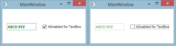
[code language="xml"]
<StackPanel x:Name="LayoutRoot" Margin="0,50,0,0">
<TextBox VerticalAlignment="Center" HorizontalAlignment="Left" FontWeight="Bold"
IsEnabled="{Binding IsChecked, ElementName=checkBox, IsAsync=True}"
MinWidth="100" Margin="0" Height="24" Text="ABCD XYZ" VerticalContentAlignment="Center">
<TextBox.Style>
<Style TargetType="{x:Type TextBox}">
<Setter Property="Foreground" Value="Green" />
</Style>
</TextBox.Style>
</TextBox>
</StackPanel>
[/code]
Và đây là kết quả khi tôi dùng Trigger

[code language="xml"]
<WrapPanel VerticalAlignment="Top" HorizontalAlignment="Center">
<TextBox VerticalAlignment="Center" HorizontalAlignment="Left" FontWeight="Bold"
IsEnabled="{Binding IsChecked, ElementName=checkBox, IsAsync=True}"
MinWidth="100" Margin="0" Height="24" Text="ABCD XYZ" VerticalContentAlignment="Center">
<TextBox.Style>
<Style TargetType="{x:Type TextBox}">
<Setter Property="Foreground" Value="Green" />
<Style.Triggers>
<Trigger Property="IsEnabled" Value="False">
<Setter Property="Foreground" Value="Blue" />
</Trigger>
</Style.Triggers>
</Style>
</TextBox.Style>
</TextBox>
<CheckBox x:Name="checkBox" IsChecked="True" Content="IsEnabled for TextBox" Margin="20,0,0,0" HorizontalAlignment="Left" VerticalAlignment="Center"/>
</WrapPanel>
[/code]
II> Data triggers
Khác với PropertyTrigger ở chỗ, DataTrigger sẽ kiểm soát sự thay đổi về mặt dữ liệu của các Control/Element - tức phạm vi không chỉ giới hạn ở các property mà là tất cả các dạng Data có thể binding.
Ví dụ dưới đây tôi có 2 TextBox(trên và dưới), tôi áp dụng DataTrigger cho textBox trên, TextBox này sẽ có màu chữ mặc định là Xanh, nhưng khi tôi ghi chữ "Checked" vào ô TextBox dưới thì ở TextBox trên sẽ có màu chữ là Xanh.

[code language="xml"]
<StackPanel VerticalAlignment="Top" Margin="10,0">
<TextBox VerticalAlignment="Center"
MinWidth="100" Margin="0" Text="Tiềm Hiểu Về Trigger Trong WPF" VerticalContentAlignment="Center" Height="20">
<TextBox.Style>
<Style TargetType="{x:Type TextBox}">
<Setter Property="Foreground" Value="Green" />
<Style.Triggers>
<DataTrigger Binding="{Binding Text, ElementName=textBox}" Value="Checked">
<Setter Property="Foreground" Value="Blue" />
</DataTrigger>
</Style.Triggers>
</Style>
</TextBox.Style>
</TextBox>
<TextBox x:Name="textBox" VerticalAlignment="Center"
MinWidth="100" Margin="0,10,0,0" Text="Checked" VerticalContentAlignment="Center" Height="20"/>
</StackPanel>
[/code]
III> Event triggers
EventTriggers dùng khi phải làm việc với các sự kiện của chuột, bàn phím... Tôi thường thấy mọi người dùng loại Trigger này kèm theo Storyboard(Sẽ nói về vấn đề này ở bài sau) nhằm thực thi một chuyển động, hiệu ứng màu sắc...
Sau đây tôi sẽ dùng EventTriggers để xử lý sự kiện MouseEnter, khi người dùng di chuyển chuột vào vùng TextBox, lập tức TextBox này sẽ Trigger sự kiện chuột và thực thi một hành động đó là phóng to chữ.

[code language="xml"]
<TextBox VerticalAlignment="Center"
MinWidth="100" Margin="0" Text="Tiềm Hiểu Về Trigger Trong WPF" VerticalContentAlignment="Center" Padding="0,0,0,1">
<TextBox.Style>
<Style TargetType="{x:Type TextBox}">
<Setter Property="Foreground" Value="Green" />
<Style.Triggers>
<EventTrigger RoutedEvent="MouseEnter">
<EventTrigger.Actions>
<BeginStoryboard>
<Storyboard AutoReverse="True">
<DoubleAnimation Duration="0:0:0.800" Storyboard.TargetProperty="FontSize" To="16" />
</Storyboard>
</BeginStoryboard>
</EventTrigger.Actions>
</EventTrigger>
</Style.Triggers>
</Style>
</TextBox.Style>
</TextBox>
[/code]
Nếu áp dụng thành thục các Trigger trên vào Styles và Templates chắc chắn chúng ta sẽ có một ứng dụng vô cùng tiện lợi và đẹp mặt người dùng.
Chúc các bạn thành công!
Phạm Tuân
Chủ Nhật, 4 tháng 1, 2015
Windows Presentation Foundation(WPF) cho phép các nhà phát triển có thể thay đổi hoàn toàn cái nhìn tổng quan và cách ứng xử của các Control. Điều này được thực hiện bằng cách sử dụng Control-Style và Control-Templates. Điều đó có nghĩa là bạn có một Button nhưng nó không chỉ đơn điệu là một hình chữ nhật mà có thể là một hình ảnh náo đó mà bạn muốn. Ở nội dung này tôi sẽ hướng dẫn các bạn tạo một Control-Templates cho TextBox.
Trước hết chúng ta cần phân biệt khái niệm Style và Tamplates
- Style: là cách thể hiện của một đối tượng về màu sắc, độ trong suốt.. và các thuộc tính ấy được phủ lên đối tượng - chúng có thể được ghi đè lên các thuộc tính mặc định nếu cần thiết, các Style có thể được áp dụng cho tất cả các Element cùng loại.
- Template: là cách thể hiện nội dung mang tính "cơ bắp" hơn, nó như một bộ khung được đặc lên trên bộ khung mặc định và không thay thế chúng, các Template chỉ được áp dụng cho các Control.
Một ví dụ cho sự khác biệt giữa Style và Tamplates: Style như một bộ đồ, nếu bộ đồ ấy dành cho con người dĩ nhiên phải có tay áo, cổ áo, ống quần... tất cả những thứ đó một người bình thường đều phải có, bộ đồ ấy được khoác lên người và chúng ta sẽ không thể thấy được phần tự nhiên trước đó, trong khi đó Template có thể là một bộ cánh, một chiếc giáp chiến đồ sộ hoặc cũng có thể là một cánh tay thứ ba... Và bộ cánh sẽ mang nhiều tính hành xử hơn một bộ đồ vì thế Styles áp dụng cho Element và Template chỉ áp dụng cho Control.
Các Style và Tamplates có thể được định nghĩa trong một thẻ con của đối tượng cần áp dụng(chỉ có tác dụng trong đối tượng đó)
- <TextBox.Style>[my style]</TextBox.Style>
- <TextBox.Template>[my template]</TextBox.Template>
hoặc được định nghĩa trong cặp thẻ Resources của thẻ root(phạm vi sử dụng trong thẻ root)
- <Window.Resources>[my style][my template]</Window.Resources>
- <Control.Resources>[my style][my template]</Control.Resources>
hay mở rộng phạm vi sử dụng lớn tối đa bằng cách định nghĩa chúng trong một file Resource riêng và đăng ký resource trong file App.xaml
Hôm nay tôi sẽ hướng dẫn các bạn cách tạo Style và Template cho TextBox, các bạn có thể xem các Template và Styles tôi đã làm sẵn dưới đậy.
 Phạm Tuân
Trước tiên chúng ta sẽ Add một file Resource bằng cách Add->New item và chọn Resource(WPF)
[code language="xml"]
<ResourceDictionary
xmlns="http://schemas.microsoft.com/winfx/2006/xaml/presentation"
xmlns:x="http://schemas.microsoft.com/winfx/2006/xaml" mc:Ignorable="d">
<!-- Các resource được được định nghĩa dưới đây-->
<!-- Các resource được được định nghĩa bên trên-->
</ResourceDictionary>
[/code]
Quay lại file App.xaml, chúng ta hoàn thiện việc đăng ký resource như sau
[code language="xml"]
<Application
xmlns="http://schemas.microsoft.com/winfx/2006/xaml/presentation"
xmlns:x="http://schemas.microsoft.com/winfx/2006/xaml"
x:Class="WpfApplication1.App"
StartupUri="MainWindow.xaml">
<Application.Resources>
<!-- Resources scoped at the Application level should be defined here. -->
<ResourceDictionary>
<ResourceDictionary.MergedDictionaries>
<!-- Các tập tin resource được đăng ký bên dưới-->
<ResourceDictionary Source="ReDicTemplate.xaml"/>
</ResourceDictionary.MergedDictionaries>
</ResourceDictionary>
</Application.Resources>
</Application>
[/code]
I> Cách tạo một Style
Tôi thêm một thẻ <Style/> với nội dung hoàn thiện bên dưới, trong đó các property "Key, TargetType, BasedOn" nhất thiết phải có.
Mục đích của Style này là các TextBox áp dụng nó đều sẽ có nền màu xanh và chữ trắng, Padding = 5 và BorderThickness = 1, lượi ích là tôi sẽ tiết kiệm khá nhiều thời gian cho việc quy định các thuộc tính trên cho 1000 TextBox giống nhau.
[code language="xml"]
<ResourceDictionary
xmlns="http://schemas.microsoft.com/winfx/2006/xaml/presentation"
xmlns:x="http://schemas.microsoft.com/winfx/2006/xaml" mc:Ignorable="d">
<!-- Các resource được được định nghĩa dưới đây-->
<!-- Một Style phải có x:Key-->
<Style x:Key="TextBoxStyle1" BasedOn="{x:Null}" TargetType="{x:Type TextBox}">
<Setter Property="Foreground" Value="White"/>
<Setter Property="Background" Value="Green"/>
<Setter Property="BorderThickness" Value="1"/>
<Setter Property="Padding" Value="5"/>
<Setter Property="Template">
<Setter.Value>
<ControlTemplate>
<!-- Có thể định nghĩa một Template như thế này-->
</ControlTemplate>
</Setter.Value>
</Setter>
</Style>
<!-- Các resource được được định nghĩa bên trên-->
</ResourceDictionary>
[/code]
Key --> là mã nhận dạn cho một đối tượng trong ngôn ngữ XAML, được dùng khi muốn áp dụng style
BasedOn --> Chỉ ra một style parent bạn muốn kế thừa, tôi không kế thừa từ style nào cả
TargetType --> Chỉ ra một kiểu đối tượng có thể áp dụng style này, ở đây tôi dùng cho TextBox
Quay về Control chúng ta muốn áp dụng Style và set propery Style của control đó với giá trị là Key của Style trên.
[code language="xml"]
<TextBox Margin="10,10,10,0" Tag="My Name"
Text="Pham Tuan" VerticalAlignment="Top"
Style="{DynamicResource TextBoxStyle1}"/>
[/code]
Kết quả
Như vậy là xong phần Style, để có một style thật sự đẹp mắt chúng ta cần phải sử dụng nhiều kỹ thuật khác nhau Binding, Trigger, Storybroad ... tôi sẽ hướng dẫn ở một bài khác.
II> Cách tạo một Template
Template có hai dạng: Control Template và Data Template
- Control Template: Là cách thức hiển thị của một Control, tức vẽ bề ngoài của chính nó
- Data Template: Là cách hiển thị của phần dữ liệu mà nó chứa đựng, tức vẽ bề ngoài của các Item khi nó hiển thị trong lòng mình(Thường dùng với các control như ListBox, GridView, ComboBox...)
A> ControlTemplate
Tôi thêm một thẻ <ControlTemplate/> với nội dung hoàn thiện bên dưới, trong đó các property "Key, TargetType" nhất thiết phải có.
Mục đính tôi tạo một Template vì tôi muốn có một TextBox với phần Title hiển thị phía trước và phần nhập nội dung lền kề bên phải, phần cuối cùng bên phải TextBox có một Icon làm cảnh, màu nền phần Title trùng màu viền của TextBox(Nên tôi dùng TemplateBinding BorderBrush), nội dung Title được Binding đến thuộc tính Tag của TextBox(Nên tôi dùng TemplateBinding Tag)
[code language="xml"]
<ResourceDictionary
xmlns="http://schemas.microsoft.com/winfx/2006/xaml/presentation"
xmlns:x="http://schemas.microsoft.com/winfx/2006/xaml" mc:Ignorable="d">
<!-- Các resource được được định nghĩa dưới đây-->
<!-- Phần Style ở trên sẽ ở đây-->
<!-- Một ControlTemplate phải có x:Key-->
<ControlTemplate x:Key="TextBoxBaseTemplate" TargetType="{x:Type TextBoxBase}">
<Border x:Name="border" BorderBrush="{TemplateBinding BorderBrush}"
BorderThickness="{TemplateBinding BorderThickness}" Background="{TemplateBinding Background}" SnapsToDevicePixels="True">
<Grid Background="{TemplateBinding Background}">
<Grid.ColumnDefinitions>
<ColumnDefinition Width="Auto"/>
<ColumnDefinition Width="*"/>
<ColumnDefinition Width="Auto"/>
</Grid.ColumnDefinitions>
<Label Grid.Column="0" MinWidth="100" Content="{TemplateBinding Tag}" Padding="4,1,4,2" VerticalContentAlignment="Center" Background="{TemplateBinding BorderBrush}" Foreground="White"/>
<ScrollViewer x:Name="PART_ContentHost" Focusable="False" HorizontalScrollBarVisibility="Hidden" VerticalScrollBarVisibility="Hidden" Grid.ColumnSpan="1" Grid.Column="1" VerticalContentAlignment="Center" Padding="0,0,0,2"/>
<Label FontFamily="Webdings" Content="." VerticalContentAlignment="Center" Padding="5,0" Foreground="White" Margin="0" Grid.Column="3" Background="{TemplateBinding BorderBrush}"/>
</Grid>
</Border>
</ControlTemplate>
<!-- Các resource được được định nghĩa bên trên-->
</ResourceDictionary>
[/code]
Border --> kể từ thẻ này đến các thẻ con là phần chúng ta thiết kế
ScrollViewer --> là thẻ mặc định của TextBox chịu trách nhiệm hiển thị và nhận key nhập từ bản phím, tôi giữ nguyên như mặc định.
Chú ý --> Chúng ta sẽ bắc gặp một định dạng như sau Content="{TemplateBinding Tag}" ý nghĩa như sau: TemplateBinding là một kiểu DataBinding nhưng Binding đến các thuộc tính của một Control đã được chỉ ra tại thuộc tính TargetType.
Cũng như Style, chúng ta áp dụng template cho một control bằng cách gọi key của nó
[code language="xml"]
<TextBox Margin="10,10,10,0" TextWrapping="Wrap" Tag="My Name"
Text="Pham Tuan" VerticalAlignment="Top" BorderBrush="#FF007ACC"
Template="{DynamicResource TextBoxBaseTemplate}" Padding="0,2"/>
[/code]
Kết quả
 B> DataTemplate

Tôi xin nhắc lại rằng, DataTemplate dùng để thể hiện cho một Item trong ItemSource của các control có khả năng chứa các list item như ComboBox, ListBox, GridView...
Ở ví dụ này tôi có một class Per chứa thông tin một người gồm Name, YearOld, Address, Title, nếu tôi dùng một ListBox đơn thuần - tôi sẽ hiển thị được duy nhất một nội dung tương ứng một property trong các property của đối tượng Per cho mỗi item của ListBox.
[code language="csharp"]
internal class Per
{
public string Title { set; get; }
public string Name { set; get; }
public int YearOld { set; get; }
public string Address { set; get; }
}
public partial class MainWindow : Window
{
public MainWindow()
{
this.InitializeComponent();
var list = new List<Per>()
{
new Per() {Name = "Phạm Tuân",Title = "Quán quân" ,Address = "Phước Long B, Q9", YearOld = 21},
new Per() {Name = "Phạm Văn Chu", Title = "Á quân",Address = "Phước Long A, Q9", YearOld = 22}
};
listBox.ItemsSource = list; //ListBox trên
listBox2.ItemsSource = list; //ListBox dưới
}
}
[/code]
[caption id="attachment_294" align="aligncenter" width="660"]
 No-DataTemplate[/caption]
Nhưng tôi muốn hiển thị trong ListBox nhiều thông tin hơn thế thì làm thế nào? Tôi tiến hành thiết kế DataTemplate, tôi add dataTemplate cho ListBox , với mỗi Item của ListBox sẽ chứa 3 TextBox hiển thị 3 nội dung khác nhau được Binding đến 3 thuộc tính của một Item như sau trong ListBox.ItemSource.
[code language="xml"]
<ListBox.ItemTemplate>
<DataTemplate>
<!-- Tiến hành thiết kế Start-->
<!--Thiết kế cho một Item của ListBox Start-->
<GroupBox Header="{Binding Title}"> <!--Binding đến thuộc tính Title-->
<StackPanel x:Name="panel" HorizontalAlignment="Stretch" >
<!--TextBox1 Binding đến thuộc tính Name-->
<TextBox Margin="2,2,2,0" Text="{Binding Name}"/>
<!--TextBox1 Binding đến thuộc tính YearOld-->
<TextBox Margin="2,2,2,0" Text="{Binding YearOld}" />
<!--TextBox1 Binding đến thuộc tính Address-->
<TextBox Margin="2,2,2,2" Text="{Binding Address}"/>
</StackPanel>
</GroupBox>
<!--Thiết kế cho một Item của ListBox End-->
<!-- Tiến hành thiết kế End-->
</DataTemplate>
</ListBox.ItemTemplate>
[/code]
Kết quả

Để cho đẹp hơn(theo cách cảu tôi), 3 TextBox kia tôi sẽ apply cho nó 3 ControlTemplate tôi đã thiết kế trước đó.
[code language="xml"]
<ListBox.ItemTemplate>
<DataTemplate>
<GroupBox Header="{Binding Title}">
<StackPanel x:Name="panel" HorizontalAlignment="Stretch" >
<TextBox Margin="2,2,2,0" TextWrapping="Wrap" Tag="Name" BorderThickness="0"
Text="{Binding Name}" VerticalAlignment="Top" VerticalContentAlignment="Center"
BorderBrush="Green" Template="{DynamicResource TextBoxBase2}"
Background="{x:Null}" Padding="0,2"/>
<TextBox Margin="2,2,2,0" TextWrapping="Wrap" Tag="Year-Old"
Text="{Binding YearOld}" VerticalAlignment="Top" VerticalContentAlignment="Center"
BorderBrush="#FF007ACC" Template="{DynamicResource TextBoxBaseTemplate}"
Background="{x:Null}" Padding="0,2"/>
<TextBox Margin="2,2,2,2" TextWrapping="Wrap" Tag="Address"
Text="{Binding Address}" VerticalAlignment="Top" VerticalContentAlignment="Center"
BorderBrush="#FF007ACC" Template="{DynamicResource TextBoxBaseTemplate}"
Background="{x:Null}" Padding="0,2"/>
</StackPanel>
</GroupBox>
</DataTemplate>
</ListBox.ItemTemplate>
[/code]
Kết quả là

Các bạn có thể tham khảo sourcecode, hãy đoán đọc các kỹ thuật tiếp theo để có một Template thật sự linh hoạt và thân thiện.
Chúc các bạn thành công!
Phạm Tuân
Đăng ký:
Bài đăng (Atom)