
Blog chia sẽ kinh nghiệm lập trình và Technical VN. Nơi mà các bạn có thể học tập và tham khảo về những công nghệ mới nhất hiện nay về .NET
Thứ Bảy, 31 tháng 1, 2015
Khi các bạn làm một dự án khá lớn, nhu cầu tạo ra các Custom Control là không tránh khỏi, trong WinForm hay WPF đều cho phép chúng ta tạo ra các User-Control(userCtrl) với mục đích trên; Nói về khía cạnh WPF, để tạo ra một user-control có tính thuận tiện và linh hoạt cao chúng ta cần áp dụng nhiều kỹ thuật trong thiết kế cũng như lập trình - hôm nay chúng ta sẽ nói về một điều trong nhiều điều phải nắm nếu có ý định tạo một Control mang phong cách cá nhân.
Trong ví dụ sau đây tôi có một user-Control, userCtrl này chứa một TextBox, một Button và một Lable.

Trong XAML tôi thiết kế như sau
[code language="xml"]
<UserControl x:Name="userControl" x:Class="Dependency_property.userControls.MyuserControl"
xmlns="http://schemas.microsoft.com/winfx/2006/xaml/presentation"
xmlns:x="http://schemas.microsoft.com/winfx/2006/xaml"
xmlns:mc="http://schemas.openxmlformats.org/markup-compatibility/2006"
xmlns:d="http://schemas.microsoft.com/expression/blend/2008"
mc:Ignorable="d"
d:DesignHeight="100" d:DesignWidth="300">
<Grid>
<Grid.ColumnDefinitions>
<ColumnDefinition Width="Auto"/>
<ColumnDefinition Width="*"/>
<ColumnDefinition Width="Auto"/>
</Grid.ColumnDefinitions>
<Grid Background="#FF3399FF">
<Label Content="Header" VerticalContentAlignment="Center" Padding="5,1" Foreground="White"/>
</Grid>
<TextBox Grid.Column="1" VerticalContentAlignment="Center" Padding="5,1"/>
<Button x:Name="btnAction"Grid.Column="2"/>
</Grid>
</UserControl>
[/code]
Vấn đề phát sinh khi tôi dùng userCtrl này, tôi không thể nào thay đổi được nội dung của Button và cũng như không thể Get giá trị từ TextBox bởi vì các control này đã được che phủ bởi userCtrl nên tôi không thể nào truy cập được đến các thuộc tính của các control trong nó; giải quyết vấn đề này bằng Code-behind thì khá đơn giản nhưng chúng ta lại đang làm việc với WPF - XAML và vấn đề trực quan trong design là quan trọng.
[code language="xml"]
<StackPanel>
<!-- Làm sao để set Content cho Button bên trong userCtrl đây -->
<!-- Làm gì thấy được Button mà set trực tiếp -->
<local:MyuserControl x:Name="txtAdv"/>
</StackPanel>
[/code]
Cách giải quyết tôi đề cập ở trên cho code-behind là chúng ta tạo một số property của userCtrl làm cầu nối để set hoặc get value của các control bên trong - giống như cách nhìn nhận trong bài viết Create intance ; xong cách làm này có một số nhược điểm và Microsoft không khuyến cáo dùng(Cứ thử làm với các project lớn đi rồi sẽ gặp một vài vấn đề... hihi); Vì thế chúng ta dùng Dependency Property, ưu điểm là Dependency Property sẽ hỗ trợ nhiều khía cạnh hơn trong WPF(Style, Template, kế thừa property, hình ảnh động, 3D...) Cách dùng Dependency Property như sau:
1> Đăng ký Dependency Property
Trong code behind của userCtrl chúng ta tạo một Dependency Property
[code language="csharp"]
// Cho button
public static readonly DependencyProperty
ButtonContentproperty = DependencyProperty.Register(
"ButtonContent", typeof (object), typeof (MyuserControl),
new UIPropertyMetadata("Action"));
// Cho textBox
public static readonly DependencyProperty
TextBoxTextproperty = DependencyProperty.Register(
"TextBoxText", typeof (string), typeof (MyuserControl),
new UIPropertyMetadata("No text", OnValueChanged));
// Sự khác biệt khi textBox có thêm method "OnValueChanged"
// Vì tôi muốn làm một vài điều khi nội dung textBox bị changed
[/code]
Lưu ý:
- "ButtonContentproperty" là tên của DependencyProperty, property này sẽ được đăng ký với Type là object vì Content của Button là một object, Type của userCtrl sẽ sử dụng được nó là MyuserControl, và giá trị mặc định là một chuổi "Action".
- ButtonContentproperty này sẽ không thật sự dùng để chúng ta làm việc với XAML đâu nhé, trong XAML chúng ta truy xuất đến DependencyProperty với tên "ButtonContent" - lưu ý tên này(*)
2> Tạo một property thông thường
Tiếp theo tạo lần lược các property với kiểu trùng kiểu của DependencyProperty tương ứng, tên là tên tương ứng (ví dụ "ButtonContent" trùng với (*))
[code language="csharp"]
// Cho button
public object ButtonContent
{
// Property này sẽ truy xuất đến DependencyProperty trên kia
get { return GetValue(ButtonContentproperty); }
set { SetValue(ButtonContentproperty, value); }
}
// Cho textBox
public string TextBoxText
{
// Property này sẽ truy xuất đến DependencyProperty trên kia
get { return (string) GetValue(TextBoxTextproperty); }
set { SetValue(TextBoxTextproperty, value); }
}
[/code]
3> Làm việc với Event
Tới đây chúng ta đã xong phần DependencyProperty, để hoàn chỉnh userCtrl này chúng ta cần xử lý việc Click button, đơn giản là tại code-behind của userCtrl ta public một event "ButtonClick" kiểu RoutedEventHandler để bên ngoài có thể tiếp cận; tại XAML của userCtrl, sự kiện Click của Button được chỉ định đến một Method "ActionExecuting" trong code-behind của userCtrl - tại đây chúng ta kiểm tra và thực thi event "ButtonClick"
[code language="csharp"]
// Nơi dùng userCtrl sẽ đăng ký event này
public event RoutedEventHandler ButtonClick;
// Khi Button.Click sảy ra, hàm dưới đây sẽ được gọi để thực thi các đăng ký event
private void ActionExecuting(object sender, RoutedEventArgs e)
{
if (ButtonClick != null)
{
ButtonClick.Invoke(this, new RoutedEventArgs());
}
}
[/code]
XAML của userCtrl
[code language="xml"]
<!-- nội dung khác -->
<Button x:Name="btnAction" Grid.Column="2" Margin="2,0,0,0"
Content="{Binding ButtonContent, ElementName=userControl,
UpdateSourceTrigger=PropertyChanged}"
Click="ActionExecuting"/>
<!-- nội dung khác -->
[/code]
Lưu ý: cách xử lý này vẫn cùi mía, cách rồ hơn đề cập sau
4> Cách dùng
Hãy xem về Binding nếu bạn chưa biết nhé, sau đây tôi binding Content/Text của các control đến property của userCtrl(là property chứ không phải DependencyProperty nha)
[code language="xml"]
<UserControl x:Name="userControl" x:Class="Dependency_property.userControls.MyuserControl"
xmlns="http://schemas.microsoft.com/winfx/2006/xaml/presentation"
xmlns:x="http://schemas.microsoft.com/winfx/2006/xaml"
xmlns:mc="http://schemas.openxmlformats.org/markup-compatibility/2006"
xmlns:d="http://schemas.microsoft.com/expression/blend/2008"
mc:Ignorable="d"
d:DesignHeight="100" d:DesignWidth="300">
<Grid>
<Grid.ColumnDefinitions>
<ColumnDefinition Width="Auto"/>
<ColumnDefinition Width="*"/>
<ColumnDefinition Width="Auto"/>
</Grid.ColumnDefinitions>
<Grid Background="#FF3399FF">
<Label Content="Header" VerticalContentAlignment="Center" Padding="5,1" Foreground="White"/>
</Grid>
<TextBox Text="{Binding TextBoxText, ElementName=userControl, UpdateSourceTrigger=PropertyChanged}" Grid.Column="1"
VerticalContentAlignment="Center" Padding="5,1"/>
<Button x:Name="btnAction"
Content="{Binding ButtonContent, ElementName=userControl, UpdateSourceTrigger=PropertyChanged}"
Click="ActionExecuting" Grid.Column="2"/>
</Grid>
</UserControl>
<!-- trong nội dung binding, ElementName=userControl là chỉ userCtrl cha -->
[/code]
Gọi dùng user-Control ở MainWindow
[code language="xml"]
<Window x:Class="Dependency_property.MainWindow"
xmlns="http://schemas.microsoft.com/winfx/2006/xaml/presentation"
xmlns:x="http://schemas.microsoft.com/winfx/2006/xaml"
xmlns:local ="clr-namespace:Dependency_property.userControls"
Title="MainWindow" Height="200" Width="525">
<Grid>
<local:MyuserControl x:Name="txtAdv" VerticalAlignment="Center" Margin="10,0" Height="30"
ButtonClick="TxtAdv_OnButtonClick"
TextBoxText="Hello world! this is user-control"
ButtonContent="Show" />
</Grid>
</Window>
[/code]
Kết quả

Chúc các bạn thành công! source code
Phạm Tuân
"Làm sao để tạo một thể hiện của một class bằng việc sử dụng code XAML?", việc tạo một Instance trong code Behind là quá đơn giản (var intance = new ABC{ PrA = "property", PrB = 10};) xong để khởi tạo một Intance và gán giá trị cho các property cho nó thông qua code XAML thế nào chúng ta sẽ cùng xem ví dụ sau đâu.
I> Phần I: Tạo một Intance từ Internal class
Tôi tạo một Class như sau trong chính project của mình
[code language="csharp"]
public class Book
{
public string Name { get; set; }
public string Author { get; set; }
public decimal Price { get; set; }
public int YearPublished { get; set; }
}
[/code]
Tôi gọi là internal class vì class này cùng namespace với class MainWindow và chúng có quan hệ nội bộ
Để tạo intance của Class Book bằng code XAML tôi làm như sau
[code language="xml"]
<Window x:Class="Creating_instances_in_XAML.MainWindow"
xmlns="http://schemas.microsoft.com/winfx/2006/xaml/presentation"
xmlns:x="http://schemas.microsoft.com/winfx/2006/xaml"
xmlns:local="clr-namespace:Creating_instances_in_XAML"
Title="MainWindow" Height="200" Width="400">
<StackPanel>
<Button>
<local:Book Name="Study WPF"
Author="Phạm Tuân" Price="40"
YearPublished="2015" />
</Button>
<ContentControl>
<local:Book Name="Study WPF QuickStart"
Author="Phạm Tuân" Price="40"
YearPublished="2015" />
</ContentControl>
</StackPanel>
</Window>
[/code]
Hãy chú ý rằng:
- "local" là một từ khóa đại diện cho một namespace chứa class mà bạn muốn tạo intance
- <local:Book /> chính là class Book sẽ được tạo intance, các property của class Book được gọi tên và gán giá trị bên trong thẻ này.
- Một intance không kế thừa từ Controls sẽ phải được bao bọc bởi một control intance nào đó - tức thẻ <local:Book /> phải nằm trong thẻ của một số control chứ không được viết trực tiếp trong một thẻ panel

Kết quả hiển thị cho ta điểu này

Các bạn sẽ tự hỏi cái chúng ta nhận được trên GUI liệu có mục đích gì khi phần nội dung không có ý nhĩa, vâng! chúng là vô dụng nếu chỉ hiển có thế. Quay lại class Book vừa tạo và thay đổi như sau
[code language="csharp"]
public class Book
{
public string Name { get; set; }
public string Author { get; set; }
public decimal Price { get; set; }
public int YearPublished { get; set; }
public override string ToString()
{
return string.Format("{0} by {1}, Published {2}", Name,
Author, YearPublished);
}
}
[/code]
ToString() sẽ được tự động gọi để in dữ liệu ra GUI. Kết quả ta nhận được là

Đó là điều chúng ta cần trong một số trường hợp với Binding.
II> Phần II: Tạo một Intance từ External class
Trước tiên tôi tạo mới một project là Class Library, trong project này tôi tạo một class là Book như ở phần I
[code language="csharp"]
namespace ClassLibrary
{
public class Book
{
public string Name { get; set; }
public string Author { get; set; }
public decimal Price { get; set; }
public int YearPublished { get; set; }
public override string ToString()
{
return string.Format("{0} by {1}, Published {2}", Name,
Author, YearPublished);
}
}
}
[/code]
Quay lại project WPF tôi add reference đến project library trên, code XAML tôi dùng như dưới
[code language="xml"]
<Window x:Class="Creating_instances_in_XAML.MainWindow"
xmlns="http://schemas.microsoft.com/winfx/2006/xaml/presentation"
xmlns:x="http://schemas.microsoft.com/winfx/2006/xaml"
xmlns:local="clr-namespace:Creating_instances_in_XAML"
xmlns:classLibrary="clr-namespace:ClassLibrary;assembly=ClassLibrary"
Title="MainWindow" Height="200" Width="400">
<StackPanel>
<Button>
<local:Book Name="Study WPF"
Author="Phạm Tuân" Price="40"
YearPublished="2015" />
</Button>
<Button>
<classLibrary:Book Name="Study WPF QuickStart"
Author="Phạm Tuân" Price="80"
YearPublished="2019" />
</Button>
</StackPanel>
</Window>
[/code]
Chú ý hai từ khóa local và classLibrary, bạn đã thấy sự khác biệt chưa, hãy lưu ý cách khai báo này cho internal và external class
[code language="csharp"]
xmlns:local="clr-namespace:Creating_instances_in_XAML"
xmlns:classLibrary1="clr-namespace:ClassLibrary;assembly=ClassLibrary"
[/code]
Ngoài ra chúng ta còn cách khác để khai báo trước khi dùng thư viện ngoài như sau - cách này chuyên nghiệp và chính thống hơn. Bạn có để ý thấy rằng để refer đến một library của Microsoft trong XAML người ta chỉ dùng Web Address không, để dùng được như thế ta quay lại Class Book ở project Library và thêm một Attribute vào namspace như thế này
[code language="csharp"]
using System.Windows.Markup;
[assembly: XmlnsDefinition("http://mylibrary.com", "ClassLibrary")]
namespace ClassLibrary
{
public class Book
{
public string Name { get; set; }
public string Author { get; set; }
public decimal Price { get; set; }
public int YearPublished { get; set; }
public override string ToString()
{
return string.Format("{0} by {1}, Published {2}", Name,
Author, YearPublished);
}
}
}
[/code]
Ở XAML chúng ta thay thế cái cần thay thế
[code language="xml"]
<!-- Thay dòng sau -->
xmlns:classLibrary="clr-namespace:ClassLibrary;assembly=ClassLibrary"
<!-- bằng dòng dưới này-->
xmlns:classLibrary="http://mylibrary.com"
[/code]
Chúng ta có cùng một kết quả như phần I. Nếu chúng ta có các sub-namspace thì làm như sau
[code language="csharp"]
using System.Windows.Markup;
// Address sẽ thêm như sau
[assembly: XmlnsDefinition("http://mylibrary.com/OrtherBook", "ClassLibrary.OrtherBook")]
namespace ClassLibrary.OrtherBook
{
public class StoryBook
{
public string Name { get; set; }
public string Author { get; set; }
public decimal Price { get; set; }
public int YearPublished { get; set; }
public override string ToString()
{
return string.Format("{0} by {1}, Published {2}", Name,
Author, YearPublished);
}
}
}
[/code]
Code XAML dùng khác hơn một xíu
[code language="xml"]
<Window x:Class="Creating_instances_in_XAML.MainWindow"
xmlns="http://schemas.microsoft.com/winfx/2006/xaml/presentation"
xmlns:x="http://schemas.microsoft.com/winfx/2006/xaml"
xmlns:local="clr-namespace:Creating_instances_in_XAML"
<!-- Lưu ý sự thay đổi tại dòng dưới-->
xmlns:ortherBook="http://mylibrary.com/OrtherBook"
Title="MainWindow" Height="200" Width="400">
<StackPanel>
<Button>
<ortherBook:StoryBook Name="Study WPF QuickStart"
Author="Phạm Tuân" Price="80"
YearPublished="2019" />
</Button>
</StackPanel>
</Window>
[/code]
Chúc các bạn thành công
Phạm Tuân
Chủ Nhật, 25 tháng 1, 2015
Các trạng thái của TextBox
a) disable
b) normal
c) focus

Đến Mục lục Android UI
TextBox style
[code language="xml"]
<Style TargetType="{x:Type TextBox}">
<Setter Property="SnapsToDevicePixels" Value="True" />
<Setter Property="VerticalContentAlignment" Value="Center" />
<Setter Property="Foreground" Value="#FF272727" />
<Setter Property="FocusVisualStyle" Value="{x:Null}" />
<Setter Property="Template">
<Setter.Value>
<ControlTemplate TargetType="{x:Type TextBoxBase}">
<Border Name="MainBorder" Background="Transparent" CornerRadius="2">
<Grid Margin="4" >
<Grid.ColumnDefinitions>
<ColumnDefinition Width="*" />
<ColumnDefinition Width="Auto" />
</Grid.ColumnDefinitions>
<Border Name="BorderUnderline"
Padding="2"
Margin="0,0,-1,0"
BorderBrush="#808080"
BorderThickness="0,0,0,1">
<ScrollViewer Margin="0" x:Name="PART_ContentHost" />
</Border>
<Path Grid.Column="1"
Name="PathTriangle"
Data="M0,60 L20,60 20,40 z"
Fill="#808080"
Height="15"
Stretch="Fill" Width="15"
VerticalAlignment="Bottom"/>
</Grid>
</Border>
<ControlTemplate.Triggers>
<Trigger Property="IsEnabled" Value="False">
<Setter TargetName="BorderUnderline" Property="BorderBrush" Value="#cccccc" />
<Setter TargetName="PathTriangle" Property="Fill" Value="#cccccc" />
<Setter Property="Foreground" Value="#cccccc" />
</Trigger>
<Trigger Property="IsFocused" Value="True">
<Trigger.EnterActions>
<BeginStoryboard>
<Storyboard>
<ColorAnimation Storyboard.TargetName="MainBorder" Storyboard.TargetProperty="(Border.Background).(SolidColorBrush.Color)"
To="#55029cc7" Duration="0:0:0.3" />
<ColorAnimation Storyboard.TargetName="BorderUnderline" Storyboard.TargetProperty="(Border.BorderBrush).(SolidColorBrush.Color)"
To="#029cc7" Duration="0:0:0.3" />
<ColorAnimation Storyboard.TargetName="PathTriangle" Storyboard.TargetProperty="(Path.Fill).(SolidColorBrush.Color)"
To="#029cc7" Duration="0:0:0.3"/>
</Storyboard>
</BeginStoryboard>
</Trigger.EnterActions>
<Trigger.ExitActions>
<BeginStoryboard>
<Storyboard>
<ColorAnimation Storyboard.TargetName="MainBorder" Storyboard.TargetProperty="(Border.Background).(SolidColorBrush.Color)"
To="Transparent" Duration="0:0:0.3" />
<ColorAnimation Storyboard.TargetName="BorderUnderline" Storyboard.TargetProperty="(Border.BorderBrush).(SolidColorBrush.Color)"
To="#808080" Duration="0:0:0.3" />
<ColorAnimation Storyboard.TargetName="PathTriangle" Storyboard.TargetProperty="(Path.Fill).(SolidColorBrush.Color)"
To="#808080" Duration="0:0:0.3"/>
</Storyboard>
</BeginStoryboard>
</Trigger.ExitActions>
</Trigger>
</ControlTemplate.Triggers>
</ControlTemplate>
</Setter.Value>
</Setter>
</Style>
[/code]
Kết quả

Đến Mục lục Android UI
a) disable
b) normal
c) focus
Đến Mục lục Android UI
TextBox style
[code language="xml"]
<Style TargetType="{x:Type TextBox}">
<Setter Property="SnapsToDevicePixels" Value="True" />
<Setter Property="VerticalContentAlignment" Value="Center" />
<Setter Property="Foreground" Value="#FF272727" />
<Setter Property="FocusVisualStyle" Value="{x:Null}" />
<Setter Property="Template">
<Setter.Value>
<ControlTemplate TargetType="{x:Type TextBoxBase}">
<Border Name="MainBorder" Background="Transparent" CornerRadius="2">
<Grid Margin="4" >
<Grid.ColumnDefinitions>
<ColumnDefinition Width="*" />
<ColumnDefinition Width="Auto" />
</Grid.ColumnDefinitions>
<Border Name="BorderUnderline"
Padding="2"
Margin="0,0,-1,0"
BorderBrush="#808080"
BorderThickness="0,0,0,1">
<ScrollViewer Margin="0" x:Name="PART_ContentHost" />
</Border>
<Path Grid.Column="1"
Name="PathTriangle"
Data="M0,60 L20,60 20,40 z"
Fill="#808080"
Height="15"
Stretch="Fill" Width="15"
VerticalAlignment="Bottom"/>
</Grid>
</Border>
<ControlTemplate.Triggers>
<Trigger Property="IsEnabled" Value="False">
<Setter TargetName="BorderUnderline" Property="BorderBrush" Value="#cccccc" />
<Setter TargetName="PathTriangle" Property="Fill" Value="#cccccc" />
<Setter Property="Foreground" Value="#cccccc" />
</Trigger>
<Trigger Property="IsFocused" Value="True">
<Trigger.EnterActions>
<BeginStoryboard>
<Storyboard>
<ColorAnimation Storyboard.TargetName="MainBorder" Storyboard.TargetProperty="(Border.Background).(SolidColorBrush.Color)"
To="#55029cc7" Duration="0:0:0.3" />
<ColorAnimation Storyboard.TargetName="BorderUnderline" Storyboard.TargetProperty="(Border.BorderBrush).(SolidColorBrush.Color)"
To="#029cc7" Duration="0:0:0.3" />
<ColorAnimation Storyboard.TargetName="PathTriangle" Storyboard.TargetProperty="(Path.Fill).(SolidColorBrush.Color)"
To="#029cc7" Duration="0:0:0.3"/>
</Storyboard>
</BeginStoryboard>
</Trigger.EnterActions>
<Trigger.ExitActions>
<BeginStoryboard>
<Storyboard>
<ColorAnimation Storyboard.TargetName="MainBorder" Storyboard.TargetProperty="(Border.Background).(SolidColorBrush.Color)"
To="Transparent" Duration="0:0:0.3" />
<ColorAnimation Storyboard.TargetName="BorderUnderline" Storyboard.TargetProperty="(Border.BorderBrush).(SolidColorBrush.Color)"
To="#808080" Duration="0:0:0.3" />
<ColorAnimation Storyboard.TargetName="PathTriangle" Storyboard.TargetProperty="(Path.Fill).(SolidColorBrush.Color)"
To="#808080" Duration="0:0:0.3"/>
</Storyboard>
</BeginStoryboard>
</Trigger.ExitActions>
</Trigger>
</ControlTemplate.Triggers>
</ControlTemplate>
</Setter.Value>
</Setter>
</Style>
[/code]
Kết quả
Đến Mục lục Android UI
Các trạng thái của RadioButton
a) normal
b) focused
c) indeterminate
d) checked
e) checked, disabled

Đến Mục lục Android UI
RadioButton style
[code language="xml"]
<Style x:Key="RadioButtonStyle" TargetType="RadioButton">
<Setter Property="SnapsToDevicePixels" Value="true" />
<Setter Property="OverridesDefaultStyle" Value="true" />
<Setter Property="BorderThickness" Value="1" />
<Setter Property="Height" Value="20" />
<Setter Property="Margin" Value="5" />
<Setter Property="FocusVisualStyle" Value="{x:Null}" />
<Setter Property="Template">
<Setter.Value>
<ControlTemplate TargetType="RadioButton">
<BulletDecorator>
<BulletDecorator.Bullet>
<Grid Height="{TemplateBinding Height}" Width="{Binding RelativeSource={RelativeSource Self}, Path=Height, UpdateSourceTrigger=PropertyChanged}"
MinHeight="20" MinWidth="20">
<Grid.ColumnDefinitions>
<ColumnDefinition Width="1*" />
<ColumnDefinition Width="3*" />
<ColumnDefinition Width="1*" />
</Grid.ColumnDefinitions>
<Grid.RowDefinitions>
<RowDefinition Height="1*" />
<RowDefinition Height="3*" />
<RowDefinition Height="1*" />
</Grid.RowDefinitions>
<Ellipse Name="EllipseMain"
Grid.Column="0" Grid.ColumnSpan="3"
Grid.Row="0" Grid.RowSpan="3"
Fill="Transparent"
StrokeThickness="{TemplateBinding BorderThickness}"
Stroke="DimGray" />
<Ellipse Name="CheckMark"
Grid.Column="1"
Grid.Row="1"
Opacity="0"
Fill="#029cc7" />
</Grid>
</BulletDecorator.Bullet>
<VisualStateManager.VisualStateGroups>
<VisualStateGroup x:Name="CommonStates">
<VisualState x:Name="Disabled">
<Storyboard>
<ColorAnimation Storyboard.TargetName="CheckMark" Storyboard.TargetProperty="(Ellipse.Fill).(SolidColorBrush.Color)"
To="LightGray" Duration="0:0:0.3" />
<ColorAnimation Storyboard.TargetName="EllipseMain" Storyboard.TargetProperty="(Ellipse.Stroke).(SolidColorBrush.Color)"
To="LightGray" Duration="0:0:0.3" />
</Storyboard>
</VisualState>
</VisualStateGroup>
<VisualStateGroup x:Name="CheckStates">
<VisualState x:Name="Checked">
<Storyboard>
<DoubleAnimation Storyboard.TargetName="CheckMark" Storyboard.TargetProperty="Opacity"
To="1" Duration="0:0:0.3" />
</Storyboard>
</VisualState>
<VisualState x:Name="Unchecked" >
<Storyboard>
<DoubleAnimation Storyboard.TargetName="CheckMark" Storyboard.TargetProperty="Opacity"
To="0" Duration="0:0:0.3" />
</Storyboard>
</VisualState>
<VisualState x:Name="Indeterminate" >
<Storyboard>
<DoubleAnimation Storyboard.TargetName="CheckMark" Storyboard.TargetProperty="Opacity"
To="1" Duration="0:0:0.3" />
<ColorAnimation Storyboard.TargetName="CheckMark" Storyboard.TargetProperty="(Ellipse.Fill).(SolidColorBrush.Color)"
To="Gray" Duration="0:0:0.3" />
</Storyboard>
</VisualState>
</VisualStateGroup>
</VisualStateManager.VisualStateGroups>
<ContentPresenter Margin="4,0,0,0"
HorizontalAlignment="Left"
VerticalAlignment="Center"
RecognizesAccessKey="True" />
</BulletDecorator>
<ControlTemplate.Triggers>
<Trigger Property="IsPressed" Value="True">
<Setter TargetName="EllipseMain" Property="Fill" Value="#55029cc7" />
</Trigger>
<Trigger Property="IsFocused" Value="True">
<Setter TargetName="EllipseMain" Property="Stroke" Value="#88029cc7" />
</Trigger>
</ControlTemplate.Triggers>
</ControlTemplate>
</Setter.Value>
</Setter>
</Style>
[/code]
Cách dùng
[code language="xml"]
<!-- Bạn có thể thoải mái tùy chỉnh kích thước -->
<RadioButton Style="{StaticResource RadioButtonStyle}" Content="" Height="30" />
[/code]
Kết quả
Đến Mục lục Android UI
a) normal
b) focused
c) indeterminate
d) checked
e) checked, disabled
Đến Mục lục Android UI
RadioButton style
[code language="xml"]
<Style x:Key="RadioButtonStyle" TargetType="RadioButton">
<Setter Property="SnapsToDevicePixels" Value="true" />
<Setter Property="OverridesDefaultStyle" Value="true" />
<Setter Property="BorderThickness" Value="1" />
<Setter Property="Height" Value="20" />
<Setter Property="Margin" Value="5" />
<Setter Property="FocusVisualStyle" Value="{x:Null}" />
<Setter Property="Template">
<Setter.Value>
<ControlTemplate TargetType="RadioButton">
<BulletDecorator>
<BulletDecorator.Bullet>
<Grid Height="{TemplateBinding Height}" Width="{Binding RelativeSource={RelativeSource Self}, Path=Height, UpdateSourceTrigger=PropertyChanged}"
MinHeight="20" MinWidth="20">
<Grid.ColumnDefinitions>
<ColumnDefinition Width="1*" />
<ColumnDefinition Width="3*" />
<ColumnDefinition Width="1*" />
</Grid.ColumnDefinitions>
<Grid.RowDefinitions>
<RowDefinition Height="1*" />
<RowDefinition Height="3*" />
<RowDefinition Height="1*" />
</Grid.RowDefinitions>
<Ellipse Name="EllipseMain"
Grid.Column="0" Grid.ColumnSpan="3"
Grid.Row="0" Grid.RowSpan="3"
Fill="Transparent"
StrokeThickness="{TemplateBinding BorderThickness}"
Stroke="DimGray" />
<Ellipse Name="CheckMark"
Grid.Column="1"
Grid.Row="1"
Opacity="0"
Fill="#029cc7" />
</Grid>
</BulletDecorator.Bullet>
<VisualStateManager.VisualStateGroups>
<VisualStateGroup x:Name="CommonStates">
<VisualState x:Name="Disabled">
<Storyboard>
<ColorAnimation Storyboard.TargetName="CheckMark" Storyboard.TargetProperty="(Ellipse.Fill).(SolidColorBrush.Color)"
To="LightGray" Duration="0:0:0.3" />
<ColorAnimation Storyboard.TargetName="EllipseMain" Storyboard.TargetProperty="(Ellipse.Stroke).(SolidColorBrush.Color)"
To="LightGray" Duration="0:0:0.3" />
</Storyboard>
</VisualState>
</VisualStateGroup>
<VisualStateGroup x:Name="CheckStates">
<VisualState x:Name="Checked">
<Storyboard>
<DoubleAnimation Storyboard.TargetName="CheckMark" Storyboard.TargetProperty="Opacity"
To="1" Duration="0:0:0.3" />
</Storyboard>
</VisualState>
<VisualState x:Name="Unchecked" >
<Storyboard>
<DoubleAnimation Storyboard.TargetName="CheckMark" Storyboard.TargetProperty="Opacity"
To="0" Duration="0:0:0.3" />
</Storyboard>
</VisualState>
<VisualState x:Name="Indeterminate" >
<Storyboard>
<DoubleAnimation Storyboard.TargetName="CheckMark" Storyboard.TargetProperty="Opacity"
To="1" Duration="0:0:0.3" />
<ColorAnimation Storyboard.TargetName="CheckMark" Storyboard.TargetProperty="(Ellipse.Fill).(SolidColorBrush.Color)"
To="Gray" Duration="0:0:0.3" />
</Storyboard>
</VisualState>
</VisualStateGroup>
</VisualStateManager.VisualStateGroups>
<ContentPresenter Margin="4,0,0,0"
HorizontalAlignment="Left"
VerticalAlignment="Center"
RecognizesAccessKey="True" />
</BulletDecorator>
<ControlTemplate.Triggers>
<Trigger Property="IsPressed" Value="True">
<Setter TargetName="EllipseMain" Property="Fill" Value="#55029cc7" />
</Trigger>
<Trigger Property="IsFocused" Value="True">
<Setter TargetName="EllipseMain" Property="Stroke" Value="#88029cc7" />
</Trigger>
</ControlTemplate.Triggers>
</ControlTemplate>
</Setter.Value>
</Setter>
</Style>
[/code]
Cách dùng
[code language="xml"]
<!-- Bạn có thể thoải mái tùy chỉnh kích thước -->
<RadioButton Style="{StaticResource RadioButtonStyle}" Content="" Height="30" />
[/code]
Kết quả
Đến Mục lục Android UI
Các trạng thái của TabControl
Tab1) normal
Tab2) focus (selected)
Tab3) tab (keyboard) focus
Tab4) disabled

Đến Mục lục Android UI
[code language="xml"]
<Style x:Key="TabControlStyle" TargetType="{x:Type TabControl}">
<Setter Property="OverridesDefaultStyle" Value="True" />
<Setter Property="SnapsToDevicePixels" Value="True" />
<Setter Property="Template">
<Setter.Value>
<ControlTemplate TargetType="{x:Type TabControl}">
<Grid KeyboardNavigation.TabNavigation="Local">
<Grid.RowDefinitions>
<RowDefinition Height="Auto" />
<RowDefinition Height="*" />
</Grid.RowDefinitions>
<TabPanel x:Name="HeaderPanel"
Grid.Row="0"
Panel.ZIndex="1"
Margin="0,0,4,-1"
IsItemsHost="True"
KeyboardNavigation.TabIndex="1"
Background="Transparent" />
<Border x:Name="Border"
Grid.Row="1"
BorderThickness="2"
CornerRadius="2"
KeyboardNavigation.TabNavigation="Local"
KeyboardNavigation.DirectionalNavigation="Contained"
KeyboardNavigation.TabIndex="2"
BorderBrush="LightGray">
<ContentPresenter x:Name="PART_SelectedContentHost" Margin="4" ContentSource="SelectedContent" />
</Border>
</Grid>
</ControlTemplate>
</Setter.Value>
</Setter>
</Style>
[/code]
TabItem style
[code language="xml"]
<Style x:Key="TabItemStyle" TargetType="{x:Type TabItem}">
<Setter Property="FontSize" Value="12"/>
<Setter Property="FontWeight" Value="Bold"/>
<Setter Property="Foreground" Value="#FF474747"/>
<Setter Property="FocusVisualStyle" Value="{StaticResource dgFocusVisualStyte}" />
<Setter Property="Template">
<Setter.Value>
<ControlTemplate TargetType="{x:Type TabItem}">
<ControlTemplate.Resources>
<Storyboard x:Key="StartAction">
<DoubleAnimation Storyboard.TargetName="Border1Highlited" Storyboard.TargetProperty="(UIElement.Opacity)" From="0" To="1" Duration="0:0:0.5"/>
<DoubleAnimation Storyboard.TargetName="Border2Highlited" Storyboard.TargetProperty="(UIElement.Opacity)" From="0" To="1" Duration="0:0:0.5"/>
</Storyboard>
<Storyboard x:Key="ExitAction">
<DoubleAnimation Storyboard.TargetName="Border1Highlited" Storyboard.TargetProperty="Opacity" From="1" To="0" Duration="0:0:0.3" />
<DoubleAnimation Storyboard.TargetName="Border2Highlited" Storyboard.TargetProperty="Opacity" From="1" To="0" Duration="0:0:0.3" />
</Storyboard>
</ControlTemplate.Resources>
<Grid x:Name="Root">
<Grid.ColumnDefinitions>
<ColumnDefinition Width="*" />
<ColumnDefinition Width="1" />
</Grid.ColumnDefinitions>
<Grid.RowDefinitions>
<RowDefinition Height="*" />
<RowDefinition Height="6" />
<RowDefinition Height="2" />
</Grid.RowDefinitions>
<Border x:Name="Border" Margin="0,0,-1,0" Background="#ededed">
<ContentPresenter x:Name="ContentSite"
VerticalAlignment="Center"
HorizontalAlignment="Center"
ContentSource="Header"
Margin="30,10,30,4"
RecognizesAccessKey="True" />
</Border>
<Border Grid.Column="1" Margin="0,10,0,4" Background="#d6d6d6" />
<Border Grid.Row="1" Grid.ColumnSpan="2" Background="#ededed"/>
<Border Grid.Row="1" Grid.ColumnSpan="2" Name="Border1Highlited" Background="Transparent"/>
<Border Grid.Row="2" Grid.ColumnSpan="2" Background="#c9c9c9"/>
<Border Grid.Row="2" Grid.ColumnSpan="2" Name="Border2Highlited" Background="Transparent"/>
</Grid>
<ControlTemplate.Triggers>
<Trigger Property="IsSelected" Value="True">
<Setter Property="Panel.ZIndex" Value="100" />
<Setter TargetName="Border1Highlited" Property="Background" Value="#33b4ed" />
<Setter TargetName="Border2Highlited" Property="Background" Value="#009de2" />
<Trigger.EnterActions>
<BeginStoryboard Storyboard="{StaticResource StartAction}"/>
</Trigger.EnterActions>
<Trigger.ExitActions>
<BeginStoryboard Storyboard="{StaticResource ExitAction}"/>
</Trigger.ExitActions>
</Trigger>
<Trigger Property="IsEnabled" Value="False">
<Setter Property="Foreground" Value="#cccccc" />
</Trigger>
</ControlTemplate.Triggers>
</ControlTemplate>
</Setter.Value>
</Setter>
</Style>
[/code]
FocusVisual Style
[code language="xml"]
<Style x:Key="dgFocusVisualStyte" >
<Setter Property="Control.Template">
<Setter.Value>
<ControlTemplate>
<Border x:Name="FocusStyle" Background="#4433b4ed" />
</ControlTemplate>
</Setter.Value>
</Setter>
</Style>
[/code]
Cách sử dụng
[code language="xml"]
<TabControl Style="{StaticResource TabControlStyle}" Margin="10">
<TabItem Style="{StaticResource TabItemStyle}" Header="Tab1">tab1</TabItem>
<TabItem Style="{StaticResource TabItemStyle}" Header="Tab2">tab2</TabItem>
<TabItem Style="{StaticResource TabItemStyle}" Header="Tab3">tab3</TabItem>
<TabItem Style="{StaticResource TabItemStyle}" Header="Tab4" IsEnabled="False">tab4</TabItem>
</TabControl>
[/code]
Kết quả

Đến Mục lục Android UI
Tab1) normal
Tab2) focus (selected)
Tab3) tab (keyboard) focus
Tab4) disabled
Đến Mục lục Android UI
TabControl style
[code language="xml"]
<Style x:Key="TabControlStyle" TargetType="{x:Type TabControl}">
<Setter Property="OverridesDefaultStyle" Value="True" />
<Setter Property="SnapsToDevicePixels" Value="True" />
<Setter Property="Template">
<Setter.Value>
<ControlTemplate TargetType="{x:Type TabControl}">
<Grid KeyboardNavigation.TabNavigation="Local">
<Grid.RowDefinitions>
<RowDefinition Height="Auto" />
<RowDefinition Height="*" />
</Grid.RowDefinitions>
<TabPanel x:Name="HeaderPanel"
Grid.Row="0"
Panel.ZIndex="1"
Margin="0,0,4,-1"
IsItemsHost="True"
KeyboardNavigation.TabIndex="1"
Background="Transparent" />
<Border x:Name="Border"
Grid.Row="1"
BorderThickness="2"
CornerRadius="2"
KeyboardNavigation.TabNavigation="Local"
KeyboardNavigation.DirectionalNavigation="Contained"
KeyboardNavigation.TabIndex="2"
BorderBrush="LightGray">
<ContentPresenter x:Name="PART_SelectedContentHost" Margin="4" ContentSource="SelectedContent" />
</Border>
</Grid>
</ControlTemplate>
</Setter.Value>
</Setter>
</Style>
[/code]
TabItem style
[code language="xml"]
<Style x:Key="TabItemStyle" TargetType="{x:Type TabItem}">
<Setter Property="FontSize" Value="12"/>
<Setter Property="FontWeight" Value="Bold"/>
<Setter Property="Foreground" Value="#FF474747"/>
<Setter Property="FocusVisualStyle" Value="{StaticResource dgFocusVisualStyte}" />
<Setter Property="Template">
<Setter.Value>
<ControlTemplate TargetType="{x:Type TabItem}">
<ControlTemplate.Resources>
<Storyboard x:Key="StartAction">
<DoubleAnimation Storyboard.TargetName="Border1Highlited" Storyboard.TargetProperty="(UIElement.Opacity)" From="0" To="1" Duration="0:0:0.5"/>
<DoubleAnimation Storyboard.TargetName="Border2Highlited" Storyboard.TargetProperty="(UIElement.Opacity)" From="0" To="1" Duration="0:0:0.5"/>
</Storyboard>
<Storyboard x:Key="ExitAction">
<DoubleAnimation Storyboard.TargetName="Border1Highlited" Storyboard.TargetProperty="Opacity" From="1" To="0" Duration="0:0:0.3" />
<DoubleAnimation Storyboard.TargetName="Border2Highlited" Storyboard.TargetProperty="Opacity" From="1" To="0" Duration="0:0:0.3" />
</Storyboard>
</ControlTemplate.Resources>
<Grid x:Name="Root">
<Grid.ColumnDefinitions>
<ColumnDefinition Width="*" />
<ColumnDefinition Width="1" />
</Grid.ColumnDefinitions>
<Grid.RowDefinitions>
<RowDefinition Height="*" />
<RowDefinition Height="6" />
<RowDefinition Height="2" />
</Grid.RowDefinitions>
<Border x:Name="Border" Margin="0,0,-1,0" Background="#ededed">
<ContentPresenter x:Name="ContentSite"
VerticalAlignment="Center"
HorizontalAlignment="Center"
ContentSource="Header"
Margin="30,10,30,4"
RecognizesAccessKey="True" />
</Border>
<Border Grid.Column="1" Margin="0,10,0,4" Background="#d6d6d6" />
<Border Grid.Row="1" Grid.ColumnSpan="2" Background="#ededed"/>
<Border Grid.Row="1" Grid.ColumnSpan="2" Name="Border1Highlited" Background="Transparent"/>
<Border Grid.Row="2" Grid.ColumnSpan="2" Background="#c9c9c9"/>
<Border Grid.Row="2" Grid.ColumnSpan="2" Name="Border2Highlited" Background="Transparent"/>
</Grid>
<ControlTemplate.Triggers>
<Trigger Property="IsSelected" Value="True">
<Setter Property="Panel.ZIndex" Value="100" />
<Setter TargetName="Border1Highlited" Property="Background" Value="#33b4ed" />
<Setter TargetName="Border2Highlited" Property="Background" Value="#009de2" />
<Trigger.EnterActions>
<BeginStoryboard Storyboard="{StaticResource StartAction}"/>
</Trigger.EnterActions>
<Trigger.ExitActions>
<BeginStoryboard Storyboard="{StaticResource ExitAction}"/>
</Trigger.ExitActions>
</Trigger>
<Trigger Property="IsEnabled" Value="False">
<Setter Property="Foreground" Value="#cccccc" />
</Trigger>
</ControlTemplate.Triggers>
</ControlTemplate>
</Setter.Value>
</Setter>
</Style>
[/code]
FocusVisual Style
[code language="xml"]
<Style x:Key="dgFocusVisualStyte" >
<Setter Property="Control.Template">
<Setter.Value>
<ControlTemplate>
<Border x:Name="FocusStyle" Background="#4433b4ed" />
</ControlTemplate>
</Setter.Value>
</Setter>
</Style>
[/code]
Cách sử dụng
[code language="xml"]
<TabControl Style="{StaticResource TabControlStyle}" Margin="10">
<TabItem Style="{StaticResource TabItemStyle}" Header="Tab1">tab1</TabItem>
<TabItem Style="{StaticResource TabItemStyle}" Header="Tab2">tab2</TabItem>
<TabItem Style="{StaticResource TabItemStyle}" Header="Tab3">tab3</TabItem>
<TabItem Style="{StaticResource TabItemStyle}" Header="Tab4" IsEnabled="False">tab4</TabItem>
</TabControl>
[/code]
Kết quả
Đến Mục lục Android UI
Các trạng thái của Slider
Slider normal
Slider when onMouseOver
Slider when disable
Slider tab focus
Các thành phần của Slider
Đến Mục lục Android UI


Slider style
[code language="xml"]
<Style x:Key="SliderStyle" TargetType="{x:Type Slider}">
<Setter Property="FocusVisualStyle" Value="{StaticResource dgFocusVisualStyte}" />
<Setter Property="SnapsToDevicePixels" Value="true" />
<Setter Property="OverridesDefaultStyle" Value="true" />
<Style.Triggers>
<Trigger Property="Orientation" Value="Horizontal">
<Setter Property="MinWidth" Value="104" />
<Setter Property="MinHeight" Value="21" />
<Setter Property="Template" Value="{StaticResource HorizontalSlider}" />
</Trigger>
<Trigger Property="Orientation" Value="Vertical">
<Setter Property="MinWidth" Value="21" />
<Setter Property="MinHeight" Value="104" />
<Setter Property="Template" Value="{StaticResource VerticalSlider}" />
</Trigger>
</Style.Triggers>
</Style>
[/code]
Vertical slider template
[code language="xml"]
<ControlTemplate x:Key="VerticalSlider" TargetType="{x:Type Slider}">
<Grid Margin="5">
<Grid.ColumnDefinitions>
<ColumnDefinition Width="Auto" />
<ColumnDefinition Width="Auto" MinWidth="{TemplateBinding MinWidth}"/>
<ColumnDefinition Width="Auto"/>
</Grid.ColumnDefinitions>
<TickBar x:Name="TopTick" Visibility="Collapsed" Fill="LightGray" Placement="Left" SnapsToDevicePixels="True"
Width="4" Margin="0,0,2,0" />
<Border x:Name="TrackBackground"
Grid.Column="1"
Margin="0,10"
BorderThickness="2"
BorderBrush="LightGray"
HorizontalAlignment="Center" Width="4" />
<Track x:Name="PART_Track" Grid.Column="1">
<Track.DecreaseRepeatButton>
<RepeatButton Command="{x:Static Slider.DecreaseLarge}" Style="{StaticResource SliderRepeatButtonStyle}" />
</Track.DecreaseRepeatButton>
<Track.IncreaseRepeatButton>
<RepeatButton Command="{x:Static Slider.IncreaseLarge}" Style="{StaticResource SliderRepeatButtonStyle}"/>
</Track.IncreaseRepeatButton>
<Track.Thumb>
<Thumb x:Name="Thumb" Style="{StaticResource SliderThumbStyle}" />
</Track.Thumb>
</Track>
<TickBar x:Name="BottomTick" Grid.Column="2" Visibility="Collapsed" Fill="LightGray" Placement="Right"
Width="4" Margin="2,0,0,0" SnapsToDevicePixels="True" />
</Grid>
<ControlTemplate.Triggers>
<Trigger Property="TickPlacement" Value="TopLeft">
<Setter TargetName="TopTick" Property="Visibility" Value="Visible" />
</Trigger>
<Trigger Property="TickPlacement" Value="BottomRight">
<Setter TargetName="BottomTick" Property="Visibility" Value="Visible" />
</Trigger>
<Trigger Property="TickPlacement" Value="Both">
<Setter TargetName="TopTick" Property="Visibility" Value="Visible" />
<Setter TargetName="BottomTick" Property="Visibility" Value="Visible" />
</Trigger>
</ControlTemplate.Triggers>
</ControlTemplate>
[/code]
Horizontal slider template
[code language="xml"]
<ControlTemplate x:Key="HorizontalSlider" TargetType="{x:Type Slider}">
<Grid Margin="5">
<Grid.RowDefinitions>
<RowDefinition Height="Auto" />
<RowDefinition Height="Auto" MinHeight="{TemplateBinding MinHeight}"/>
<RowDefinition Height="Auto"/>
</Grid.RowDefinitions>
<TickBar x:Name="TopTick" Visibility="Collapsed" Fill="LightGray" Placement="Top" SnapsToDevicePixels="True"
Height="4" Margin="0,0,0,2" />
<Border x:Name="TrackBackground"
Grid.Row="1"
Margin="10,0"
BorderThickness="2"
BorderBrush="LightGray"
VerticalAlignment="Center" Height="4" />
<Track x:Name="PART_Track" Grid.Row="1">
<Track.DecreaseRepeatButton>
<RepeatButton Command="{x:Static Slider.DecreaseLarge}" Style="{StaticResource SliderRepeatButtonStyle}" />
</Track.DecreaseRepeatButton>
<Track.IncreaseRepeatButton>
<RepeatButton Command="{x:Static Slider.IncreaseLarge}" Style="{StaticResource SliderRepeatButtonStyle}"/>
</Track.IncreaseRepeatButton>
<Track.Thumb>
<Thumb x:Name="Thumb" Style="{StaticResource SliderThumbStyle}" />
</Track.Thumb>
</Track>
<TickBar x:Name="BottomTick" Grid.Row="2" Visibility="Collapsed" Fill="LightGray" Placement="Bottom"
SnapsToDevicePixels="True" Height="4" Margin="0,2,0,0"/>
</Grid>
<ControlTemplate.Triggers>
<Trigger Property="TickPlacement" Value="TopLeft">
<Setter TargetName="TopTick" Property="Visibility" Value="Visible" />
</Trigger>
<Trigger Property="TickPlacement" Value="BottomRight">
<Setter TargetName="BottomTick" Property="Visibility" Value="Visible" />
</Trigger>
<Trigger Property="TickPlacement" Value="Both">
<Setter TargetName="TopTick" Property="Visibility" Value="Visible" />
<Setter TargetName="BottomTick" Property="Visibility" Value="Visible" />
</Trigger>
</ControlTemplate.Triggers>
</ControlTemplate>
[/code]
RepeatButton style
[code language="xml"]
<Style x:Key="SliderRepeatButtonStyle" TargetType="{x:Type RepeatButton}">
<Setter Property="OverridesDefaultStyle" Value="true"/>
<Setter Property="IsTabStop" Value="false"/>
<Setter Property="Focusable" Value="false"/>
<Setter Property="Template">
<Setter.Value>
<ControlTemplate TargetType="{x:Type RepeatButton}">
<Rectangle Fill="Transparent"/>
</ControlTemplate>
</Setter.Value>
</Setter>
</Style>
[/code]
Thumb style
[code language="xml"]
<Style x:Key="SliderThumbStyle" TargetType="{x:Type Thumb}">
<Setter Property="OverridesDefaultStyle" Value="True"/>
<Setter Property="Template">
<Setter.Value>
<ControlTemplate TargetType="{x:Type Thumb}">
<Grid>
<Border Name="outerBorder"
Background="#5534b4e3"
BorderBrush="#5534b4e3"
Height="26" Width="26" Opacity="1" BorderThickness="2" CornerRadius="13"/>
<Border Name="innerBorder"
Background="#FF34b4e3"
BorderBrush="#FF34b4e3"
Height="10" Width="10" CornerRadius="5" Opacity="1" />
</Grid>
<ControlTemplate.Triggers>
<Trigger Property="IsMouseOver" Value="True">
<Setter TargetName="outerBorder" Property="BorderBrush" Value="#BB34b4e3" />
</Trigger>
<Trigger Property="IsEnabled" Value="False">
<Setter TargetName="outerBorder" Property="Background" Value="#55ACACAC" />
<Setter TargetName="outerBorder" Property="BorderBrush" Value="#55ACACAC" />
<Setter TargetName="innerBorder" Property="Width" Value="4" />
<Setter TargetName="innerBorder" Property="Height" Value="4" />
<Setter TargetName="innerBorder" Property="CornerRadius" Value="2" />
</Trigger>
</ControlTemplate.Triggers>
</ControlTemplate>
</Setter.Value>
</Setter>
</Style>
[/code]
Focus visual style
[code language="xml"]
<Style x:Key="dgFocusVisualStyte" >
<Setter Property="Control.Template">
<Setter.Value>
<ControlTemplate>
<Rectangle x:Name="FocusStyle" StrokeDashArray="4 4" RadiusX="5" RadiusY="5" Fill="Transparent"
Stroke="#99029cc7" StrokeThickness="1" />
</ControlTemplate>
</Setter.Value>
</Setter>
</Style>
[/code]
Kết quả
Đến Mục lục Android UI
Slider normal
Slider when onMouseOver
Slider when disable
Slider tab focus
Các thành phần của Slider
Đến Mục lục Android UI
Slider style
[code language="xml"]
<Style x:Key="SliderStyle" TargetType="{x:Type Slider}">
<Setter Property="FocusVisualStyle" Value="{StaticResource dgFocusVisualStyte}" />
<Setter Property="SnapsToDevicePixels" Value="true" />
<Setter Property="OverridesDefaultStyle" Value="true" />
<Style.Triggers>
<Trigger Property="Orientation" Value="Horizontal">
<Setter Property="MinWidth" Value="104" />
<Setter Property="MinHeight" Value="21" />
<Setter Property="Template" Value="{StaticResource HorizontalSlider}" />
</Trigger>
<Trigger Property="Orientation" Value="Vertical">
<Setter Property="MinWidth" Value="21" />
<Setter Property="MinHeight" Value="104" />
<Setter Property="Template" Value="{StaticResource VerticalSlider}" />
</Trigger>
</Style.Triggers>
</Style>
[/code]
Vertical slider template
[code language="xml"]
<ControlTemplate x:Key="VerticalSlider" TargetType="{x:Type Slider}">
<Grid Margin="5">
<Grid.ColumnDefinitions>
<ColumnDefinition Width="Auto" />
<ColumnDefinition Width="Auto" MinWidth="{TemplateBinding MinWidth}"/>
<ColumnDefinition Width="Auto"/>
</Grid.ColumnDefinitions>
<TickBar x:Name="TopTick" Visibility="Collapsed" Fill="LightGray" Placement="Left" SnapsToDevicePixels="True"
Width="4" Margin="0,0,2,0" />
<Border x:Name="TrackBackground"
Grid.Column="1"
Margin="0,10"
BorderThickness="2"
BorderBrush="LightGray"
HorizontalAlignment="Center" Width="4" />
<Track x:Name="PART_Track" Grid.Column="1">
<Track.DecreaseRepeatButton>
<RepeatButton Command="{x:Static Slider.DecreaseLarge}" Style="{StaticResource SliderRepeatButtonStyle}" />
</Track.DecreaseRepeatButton>
<Track.IncreaseRepeatButton>
<RepeatButton Command="{x:Static Slider.IncreaseLarge}" Style="{StaticResource SliderRepeatButtonStyle}"/>
</Track.IncreaseRepeatButton>
<Track.Thumb>
<Thumb x:Name="Thumb" Style="{StaticResource SliderThumbStyle}" />
</Track.Thumb>
</Track>
<TickBar x:Name="BottomTick" Grid.Column="2" Visibility="Collapsed" Fill="LightGray" Placement="Right"
Width="4" Margin="2,0,0,0" SnapsToDevicePixels="True" />
</Grid>
<ControlTemplate.Triggers>
<Trigger Property="TickPlacement" Value="TopLeft">
<Setter TargetName="TopTick" Property="Visibility" Value="Visible" />
</Trigger>
<Trigger Property="TickPlacement" Value="BottomRight">
<Setter TargetName="BottomTick" Property="Visibility" Value="Visible" />
</Trigger>
<Trigger Property="TickPlacement" Value="Both">
<Setter TargetName="TopTick" Property="Visibility" Value="Visible" />
<Setter TargetName="BottomTick" Property="Visibility" Value="Visible" />
</Trigger>
</ControlTemplate.Triggers>
</ControlTemplate>
[/code]
Horizontal slider template
[code language="xml"]
<ControlTemplate x:Key="HorizontalSlider" TargetType="{x:Type Slider}">
<Grid Margin="5">
<Grid.RowDefinitions>
<RowDefinition Height="Auto" />
<RowDefinition Height="Auto" MinHeight="{TemplateBinding MinHeight}"/>
<RowDefinition Height="Auto"/>
</Grid.RowDefinitions>
<TickBar x:Name="TopTick" Visibility="Collapsed" Fill="LightGray" Placement="Top" SnapsToDevicePixels="True"
Height="4" Margin="0,0,0,2" />
<Border x:Name="TrackBackground"
Grid.Row="1"
Margin="10,0"
BorderThickness="2"
BorderBrush="LightGray"
VerticalAlignment="Center" Height="4" />
<Track x:Name="PART_Track" Grid.Row="1">
<Track.DecreaseRepeatButton>
<RepeatButton Command="{x:Static Slider.DecreaseLarge}" Style="{StaticResource SliderRepeatButtonStyle}" />
</Track.DecreaseRepeatButton>
<Track.IncreaseRepeatButton>
<RepeatButton Command="{x:Static Slider.IncreaseLarge}" Style="{StaticResource SliderRepeatButtonStyle}"/>
</Track.IncreaseRepeatButton>
<Track.Thumb>
<Thumb x:Name="Thumb" Style="{StaticResource SliderThumbStyle}" />
</Track.Thumb>
</Track>
<TickBar x:Name="BottomTick" Grid.Row="2" Visibility="Collapsed" Fill="LightGray" Placement="Bottom"
SnapsToDevicePixels="True" Height="4" Margin="0,2,0,0"/>
</Grid>
<ControlTemplate.Triggers>
<Trigger Property="TickPlacement" Value="TopLeft">
<Setter TargetName="TopTick" Property="Visibility" Value="Visible" />
</Trigger>
<Trigger Property="TickPlacement" Value="BottomRight">
<Setter TargetName="BottomTick" Property="Visibility" Value="Visible" />
</Trigger>
<Trigger Property="TickPlacement" Value="Both">
<Setter TargetName="TopTick" Property="Visibility" Value="Visible" />
<Setter TargetName="BottomTick" Property="Visibility" Value="Visible" />
</Trigger>
</ControlTemplate.Triggers>
</ControlTemplate>
[/code]
RepeatButton style
[code language="xml"]
<Style x:Key="SliderRepeatButtonStyle" TargetType="{x:Type RepeatButton}">
<Setter Property="OverridesDefaultStyle" Value="true"/>
<Setter Property="IsTabStop" Value="false"/>
<Setter Property="Focusable" Value="false"/>
<Setter Property="Template">
<Setter.Value>
<ControlTemplate TargetType="{x:Type RepeatButton}">
<Rectangle Fill="Transparent"/>
</ControlTemplate>
</Setter.Value>
</Setter>
</Style>
[/code]
Thumb style
[code language="xml"]
<Style x:Key="SliderThumbStyle" TargetType="{x:Type Thumb}">
<Setter Property="OverridesDefaultStyle" Value="True"/>
<Setter Property="Template">
<Setter.Value>
<ControlTemplate TargetType="{x:Type Thumb}">
<Grid>
<Border Name="outerBorder"
Background="#5534b4e3"
BorderBrush="#5534b4e3"
Height="26" Width="26" Opacity="1" BorderThickness="2" CornerRadius="13"/>
<Border Name="innerBorder"
Background="#FF34b4e3"
BorderBrush="#FF34b4e3"
Height="10" Width="10" CornerRadius="5" Opacity="1" />
</Grid>
<ControlTemplate.Triggers>
<Trigger Property="IsMouseOver" Value="True">
<Setter TargetName="outerBorder" Property="BorderBrush" Value="#BB34b4e3" />
</Trigger>
<Trigger Property="IsEnabled" Value="False">
<Setter TargetName="outerBorder" Property="Background" Value="#55ACACAC" />
<Setter TargetName="outerBorder" Property="BorderBrush" Value="#55ACACAC" />
<Setter TargetName="innerBorder" Property="Width" Value="4" />
<Setter TargetName="innerBorder" Property="Height" Value="4" />
<Setter TargetName="innerBorder" Property="CornerRadius" Value="2" />
</Trigger>
</ControlTemplate.Triggers>
</ControlTemplate>
</Setter.Value>
</Setter>
</Style>
[/code]
Focus visual style
[code language="xml"]
<Style x:Key="dgFocusVisualStyte" >
<Setter Property="Control.Template">
<Setter.Value>
<ControlTemplate>
<Rectangle x:Name="FocusStyle" StrokeDashArray="4 4" RadiusX="5" RadiusY="5" Fill="Transparent"
Stroke="#99029cc7" StrokeThickness="1" />
</ControlTemplate>
</Setter.Value>
</Setter>
</Style>
[/code]
Kết quả
Đến Mục lục Android UI
Thứ Bảy, 24 tháng 1, 2015
Trạng thái CheckBox:
- a) checked, disable
- b) checked
- c) indeterminate, disable
- d) indeterminate
- e) unchecked
- f) pressed

Đến Mục lục Android UI
Bản thiết kế:

CheckBox style: được gọi dùng ở Control
[code language="xml"]
<Style x:Key="CheckBoxStyle" TargetType="{x:Type CheckBox}">
<Setter Property="SnapsToDevicePixels" Value="true" />
<Setter Property="OverridesDefaultStyle" Value="true" />
<Setter Property="Height" Value="30" />
<Setter Property="FocusVisualStyle" Value="{DynamicResource dgFocusVisualStyte}" />
<Setter Property="Template">
<Setter.Value>
<ControlTemplate TargetType="{x:Type CheckBox}">
<BulletDecorator>
<BulletDecorator.Bullet>
<Grid Height="{TemplateBinding Height}" Width="{Binding RelativeSource={RelativeSource Self}, Path=Height, UpdateSourceTrigger=PropertyChanged}"
MinHeight="30" MinWidth="30" ShowGridLines="False">
<Grid.ColumnDefinitions>
<ColumnDefinition Width="4*" />
<ColumnDefinition Width="1*" />
<ColumnDefinition Width="1*" />
<ColumnDefinition Width="4*" />
<ColumnDefinition Width="1*" />
<ColumnDefinition Width="1*" />
<ColumnDefinition Width="2*" />
<ColumnDefinition Width="2*" />
</Grid.ColumnDefinitions>
<Grid.RowDefinitions>
<RowDefinition Height="3*" />
<RowDefinition Height="1*" />
<RowDefinition Height="1*" />
<RowDefinition Height="1*" />
<RowDefinition Height="4*" />
<RowDefinition Height="1*" />
<RowDefinition Height="1*" />
<RowDefinition Height="4*" />
</Grid.RowDefinitions>
<Border Name="MainBorder"
Grid.ColumnSpan="9" Grid.RowSpan="9"
CornerRadius="4"
BorderThickness="1"
Background="Transparent" />
<Border Name="InnerBorder"
Grid.Column="1" Grid.ColumnSpan="5"
Grid.Row="2" Grid.RowSpan="5"
BorderThickness="1"
BorderBrush="#808080" />
<Path Name="InnerPath"
Grid.Column="1" Grid.ColumnSpan="5"
Grid.Row="2" Grid.RowSpan="5"
Data="M31,5 L19.5,5 19.5,19.5 34.5,19.5 34.5,11.75"
Stretch="Fill" Stroke="#808080"/>
<Path Name="CheckMark"
Grid.Column="2" Grid.ColumnSpan="5"
Grid.Row="1" Grid.RowSpan="5"
Opacity="0"
Data="M9.07743946676476E-09,4.31805768640244L4.68740335877841,8.86361158398516C4.68740335877841,8.86361158398516,16.3281249985376,-2.42451336648723,16.3281249985376,-2.42451336648723L14.0622100581796,-4.77304938341948 4.68740335877846,4.31805791992662 2.22656251699567,1.93164208562579z"
Fill="#3babe3"
Stretch="Fill"
Stroke="#3babe3" />
<Path Name="InderminateMark"
Grid.Column="3"
Grid.Row="4"
Data="M0,4 L1,5 5,1 4,0"
Opacity="0"
Stretch="Fill"
StrokeThickness="0"
Fill="#808080" />
</Grid>
</BulletDecorator.Bullet>
<VisualStateManager.VisualStateGroups>
<VisualStateGroup x:Name="CheckStates">
<VisualState x:Name="Checked">
<Storyboard>
<DoubleAnimation Storyboard.TargetProperty="Opacity"
Storyboard.TargetName="CheckMark" Duration="0:0:0.2" To="1" />
</Storyboard>
</VisualState>
<VisualState x:Name="Unchecked" >
<Storyboard>
<DoubleAnimation Storyboard.TargetProperty="Opacity"
Storyboard.TargetName="CheckMark" Duration="0:0:0.2" To="0" />
</Storyboard>
</VisualState>
<VisualState x:Name="Indeterminate">
<Storyboard>
<DoubleAnimation Storyboard.TargetProperty="Opacity"
Storyboard.TargetName="InderminateMark" Duration="0:0:0.2" To="1" />
</Storyboard>
</VisualState>
</VisualStateGroup>
</VisualStateManager.VisualStateGroups>
<ContentPresenter Margin="4,0,4,0"
VerticalAlignment="Center"
HorizontalAlignment="Left"
RecognizesAccessKey="True" />
</BulletDecorator>
<ControlTemplate.Triggers>
<Trigger Property="IsChecked" Value="True">
<Setter TargetName="InnerBorder" Property="Visibility" Value="Collapsed" />
</Trigger>
<Trigger Property="IsPressed" Value="True">
<Setter TargetName="MainBorder" Property="Background" Value="#81d2eb" />
</Trigger>
<Trigger Property="IsEnabled" Value="False">
<Setter TargetName="CheckMark" Property="Fill" Value="#cccccc" />
<Setter TargetName="CheckMark" Property="Stroke" Value="#cccccc" />
<Setter TargetName="InnerPath" Property="Stroke" Value="#cccccc" />
<Setter TargetName="InderminateMark" Property="Fill" Value="#cccccc" />
<Setter TargetName="InnerBorder" Property="BorderBrush" Value="#cccccc" />
</Trigger>
</ControlTemplate.Triggers>
</ControlTemplate>
</Setter.Value>
</Setter>
</Style>
[/code]
FocusVisualStyle: được gọi dùng ở Style trên
[code language="xml"]
<Style x:Key="dgFocusVisualStyte" >
<Setter Property="Control.Template">
<Setter.Value>
<ControlTemplate>
<Rectangle x:Name="FocusStyle" StrokeDashArray="4 4" RadiusX="5" RadiusY="5" Fill="Transparent"
Stroke="#81d2eb" StrokeThickness="1" />
</ControlTemplate>
</Setter.Value>
</Setter>
</Style>
[/code]
Kết quả
Đến Mục lục Android UI
Các trạng thái của ToggleButton:
a) checked; b) unchecked; c) indeterminate; d) disable; e) Tab focus

Đến Mục lục Android UI
ToggleButton style: được gọi dùng ở Control
[code language="xml"]
<Style x:Key="ToggleButtonStyle" TargetType="ToggleButton">
<Setter Property="Background" Value="#d9d9d9"/>
<Setter Property="Foreground" Value="White"/>
<Setter Property="BorderBrush" Value="#d9d9d9" />
<Setter Property="BorderThickness" Value="0"/>
<Setter Property="FocusVisualStyle" Value="{StaticResource dgFocusVisualStyte}" />
<Setter Property="FontSize" Value="13" />
<Setter Property="Template">
<Setter.Value>
<ControlTemplate TargetType="ToggleButton">
<Grid >
<Grid.ColumnDefinitions>
<ColumnDefinition Width="30*" />
<ColumnDefinition Width="30*" />
<ColumnDefinition Width="30*" />
</Grid.ColumnDefinitions>
<Grid.RowDefinitions>
<RowDefinition Height="30*" />
<RowDefinition Height="2*" />
<RowDefinition Height="2*" />
</Grid.RowDefinitions>
<VisualStateManager.VisualStateGroups>
<VisualStateGroup x:Name="CheckStates">
<VisualState x:Name="Checked">
<Storyboard>
<DoubleAnimation Storyboard.TargetName="ShapeOn" Storyboard.TargetProperty="Opacity" To="1" Duration="0:0:0.3" />
<DoubleAnimation Storyboard.TargetName="ShapeOff" Storyboard.TargetProperty="Opacity" To="0" Duration="0:0:0.3" />
</Storyboard>
</VisualState>
<VisualState x:Name="Unchecked">
<Storyboard>
<DoubleAnimation Storyboard.TargetName="ShapeOff" Storyboard.TargetProperty="Opacity" To="1" Duration="0:0:0.3" />
<DoubleAnimation Storyboard.TargetName="ShapeOn" Storyboard.TargetProperty="Opacity" To="0" Duration="0:0:0.3" />
</Storyboard>
</VisualState>
<VisualState x:Name="Indeterminate">
</VisualState>
</VisualStateGroup>
</VisualStateManager.VisualStateGroups>
<Border Grid.ColumnSpan="3"
BorderThickness="2"
BorderBrush="{TemplateBinding Background}"
Background="{TemplateBinding Background}"/>
<Path x:Name="ShapeOff"
Grid.Column="0" Grid.ColumnSpan="2"
Data="M0,0 L60,0 30,30 0,30 z"
Stretch="Fill"
Fill="#c2c2c2" HorizontalAlignment="Left" />
<Path x:Name="ShapeOn"
Grid.Column="1" Grid.ColumnSpan="2"
Data="M0,0 L30,0 30,30 -30,30 z"
Stretch="Fill"
Fill="#38abcf" HorizontalAlignment="Right" />
<Border Name="BorderLeftDown"
Grid.Row="2" Grid.Column="0"
Background="{TemplateBinding BorderBrush}"
Opacity="{Binding ElementName=ShapeOff, Path=Opacity}"/>
<Border Name="BorderRightDown"
Grid.Row="2" Grid.Column="1" Grid.ColumnSpan="2"
Background="{TemplateBinding BorderBrush}"
Opacity="{Binding ElementName=ShapeOn, Path=Opacity}"/>
<TextBlock Text="ON" Grid.Column="2"
Name="TextBlockOn"
FontWeight="Bold"
Foreground="{TemplateBinding Foreground}"
VerticalAlignment="Center" HorizontalAlignment="Center" Margin="0,0,5,0"
Opacity="{Binding ElementName=ShapeOn, Path=Opacity}"/>
<TextBlock Text="OFF" Grid.Column="0"
Name="TextBlockOff"
FontWeight="Bold"
Foreground="{TemplateBinding Foreground}"
VerticalAlignment="Center" HorizontalAlignment="Center" Margin="5,0,0,0"
Opacity="{Binding ElementName=ShapeOff, Path=Opacity}"/>
</Grid>
<ControlTemplate.Triggers>
<Trigger Property="IsEnabled" Value="False">
<Setter Property="Foreground" Value="#d9d9d9" />
<Setter TargetName="ShapeOn" Property="Fill" Value="#c2c2c2" />
</Trigger>
</ControlTemplate.Triggers>
</ControlTemplate>
</Setter.Value>
</Setter>
</Style>
[/code]
FocusVisualStyle: được gọi dùng ở Style trên
[code language="xml"]
Style x:Key="dgFocusVisualStyte" >
<Setter Property="Control.Template">
<Setter.Value>
<ControlTemplate>
<Grid>
<Grid.RowDefinitions>
<RowDefinition Height="30*" />
<RowDefinition Height="2*" />
<RowDefinition Height="2*" />
</Grid.RowDefinitions>
<Border BorderThickness="2" BorderBrush="#38abcf" />
</Grid>
</ControlTemplate>
</Setter.Value>
</Setter>
</Style>
[/code]
Kết quả

Đến Mục lục Android UI
Nội dung bài này sẽ giới thiệu đến các bạn một số Control theo phong cách giao diện của Android. Như những bài trước chúng ta đã biết về Style, Template, Storyboard, Trigger... hôm nay chúng ta sẽ thấy chúng kết hợp với nhau thế nào.
Nay tôi không hướng dẫn Step-by-Step mà chỉ đưa ra một số mẫu để các bạn có thể sử dụng luôn vào dự án của mình hoặc phát triển theo hướng khác, mời các bạn theo dõi. Chúng ta chỉ cần coppy tất cả đoạn XAML trong bài viết rồi paste vào phần resource sau đó ở Control bạn gọi đến key của Style tương ứng là dùng được().
WPF ToggleButton style: detail |
WPF RadioButton style: detail |
WPF TextBox style: detail |
WPF CheckBox style: detail |
WPF TabControl style: detail |
WPF Slider style: detail |
Chúc mọi người vui vẽ!
Phạm Tuân
theo wpfhelper
Thứ Năm, 22 tháng 1, 2015
ReSharper là một công cụ Add-on cho Visual Studio, nó giúp lập trình viên tốn ít thời gian cho việc xem xét định dạng code, phong cách code, các gợi ý sửa lỗi trực quan và chính xác... kèm theo một số tính năng nâng cao hỗ trợ VS. Làm việc với ReSharper bạn sẽ thấy tiện lợi hơn rất nhiều vì một số công việc nhàm chán nay đã được ReSharper tự động thực hiện. Xong chúng ta không nên quá tin tưởng vào công cụ nhé.

Phiên bản hiện tại(22/01/2015) là 9.0. Các bạn có thể tải và cài đặt tại đây

Hiện tại tôi vẫn dùng phiên bản 8.2.3 vì phiên bản này có công cụ "Dò mìn" tốt khi dùng Licence, tải tại đây. Tải về và cài đặt bình thường, sau đó mở VS lên và bạn nhận được hộp thoại đăng ký Licence, hãy chọn "Single User" và điền hai dòng thông tin chính xác như hình

[code language="xml"]
User Name:ronle
Licene Key:ZoJzmeVBoAv9Sskw76emgksMMFiLn4NM
[/code]
Vậy là xong bước cài đặt và đăng ký Licene. Trên thanh menu sẽ xuất hiện ReSharper,tại đây chúng ta có thể cài đặt các tùy chọn nâng cao, dưới thanh trạng thái nhìn sang cuối góc phải sẽ thấy biểu tượng trắng tròn - DoubleClick vào nó và chọn OK để ReSharper tiến hành phân tích code của chúng ta. Tại các dòng lỗi hoặc dư thừa code hoặc một số lỗi khác về mặt cú pháp chúng ta đều được nhắc nhỡ và luôn có giải pháp gợi ý... Đến đây các đã bạn có thể trãi nghiệm ReSharper.
Chúc các bạn thành công
Phạm Tuân
Tôi xin giới thiệu một số công cụ miển phí tôi hay dùng để thiết kế UML - tính năng khá đầy đủ và có nhiều sự lựa chọn cho mục đích thiết kế.
I> Astah
Công cụ này có hai phiên bản là License và Free, ngoài ra chúng ta có thể sử dụng với bản Student

II> StarUML
Cũng miễn phí nhưng công cụ này cũng khá mạnh mẽ cho công việc Design UML của chúng ta

Chúng ta có thể hoàn toàn yên tâm về môi trường cài đặt vì đây là một công cụ hỗ trợ nhiều nền tảng OS khác nhau
Updating...
Trong một số trường hợp, chúng ta muốn liên tục cập nhật thông tin về sự thay đổi của một tập tin hoặc thư mục nào đó cho người dùng và chúng ta không muốn dùng While(true) để liên tục quét đối tượng xem có thay đổi gì hay không thì cách làm sau đây là tối ưu cho nhu cầu trên.
Chúng ta sẽ tìm hiểu về FileSystemWatcher- lớp này cho phép chúng ta lắng nghe mọi sự thay đổi của một tập tin hoặc một thư mục trên HDD, mọi sự thay đối có thể là: Xóa, Đổi tên, Thêm mới, Sửa nội dung, ...

Mời các bạn xem qua ví dụ sau
[code language="csharp"]
static void Main(string[] args)
{
//Watching thư mục
RunWatcher();
Console.Read();
}
[PermissionSet(SecurityAction.Demand, Name = "FullTrust")]
public static void RunWatcher()
{
//Get đường dẫn
string path = System.Environment.CurrentDirectory;
//Check đường dẫn
if (path.Length < 2)
{
Console.WriteLine("Directory is not correct");
return;
}
//Tạo FileSystemWatcher
FileSystemWatcher watcher = new FileSystemWatcher();
watcher.Path = path;
//Chỉ watch cho các file txt
//watcher.Filter = "*.txt";
//Chỉ watch cho all file
watcher.Filter = "*.*";
//Đăng ký event
watcher.Changed += new FileSystemEventHandler(OnChanged);
watcher.Created += new FileSystemEventHandler(OnChanged);
watcher.Deleted += new FileSystemEventHandler(OnChanged);
watcher.Renamed += new RenamedEventHandler(OnRenamed);
//Begin watching.
watcher.EnableRaisingEvents = true;
Console.WriteLine("Directory is {0}",path);
}
//Define event
private static void OnChanged(object source, FileSystemEventArgs e)
{
Console.WriteLine("File: " + e.FullPath + " " + e.ChangeType);
}
private static void OnRenamed(object source, RenamedEventArgs e)
{
Console.WriteLine("File: {0} renamed to {1}", e.OldFullPath, e.FullPath);
}
[/code]
Chúc các bạn thành công!
Phạm Tuân
Thứ Ba, 20 tháng 1, 2015
Như các bạn đã biết, WPF có khá nhiều điểm mạnh và mới so với Winform trước kia, trong đó có Binding, 3D, XAML... và hôm nay chúng ta tìm hiểu về Storyboard - Nó được sử dụng để tạo ra các kịch bản hoạt họa/hoạt hình cho giao diện WPF. Để một đối tượng hình học(Sharp) có thể di chuyển trong một Panel thường chúng ta phải viết khá nhiều dòng code-behind nhưng với WPF chúng ta không nhất thiết phải làm như thế; sẽ có công cụ cho chúng ta tạo kịch bản.
I> Storyboard là gì
Trước tiên để hình dung được công dụng của Storyboard tôi sẽ có ví dụ sau đây. Tôi sẽ tạo một cửa sổ có chứa một hình Chữ nhật(với Radius khá lớn để biến thành hình tròn - chỉ để đẹp thôi), hình chữ nhật này sẽ thay đổi kích thước và màu nền khi sự kiện Rectangle.MouseEnter sảy ra - Chú ý rằng Storyboard hỗ trợ cho tất cả các loại Trigger trong code XAML, tham khảo thêm bản sau:
| Storyboard is begun using… | Per-instance | Style | Control template | Data template | Example |
|---|---|---|---|---|---|
| BeginStoryboard and an EventTrigger | Yes | Yes | Yes | Yes | How to |
| BeginStoryboard and a property Trigger | No | Yes | Yes | Yes | How to |
| BeginStoryboard and a DataTrigger | No | Yes | Yes | Yes | How to |
| Begin method | Yes | No | No | No | How to |
Có thể thực hiện ý tưởng trên bằng hai cách tương đương:
=> Code XAML
[code language="xml"]
<Window x:Class="Storyboard.MainWindow"
xmlns="http://schemas.microsoft.com/winfx/2006/xaml/presentation"
xmlns:x="http://schemas.microsoft.com/winfx/2006/xaml"
Title="MainWindow" Height="350" Width="525">
<Grid>
<Rectangle Name="MyRectangle"
Width="200"
Height="200" RadiusY="100" RadiusX="100">
<Rectangle.Fill>
<SolidColorBrush x:Name="MySolidColorBrush" Color="Blue" />
</Rectangle.Fill>
<Rectangle.Triggers>
<EventTrigger RoutedEvent="Rectangle.MouseEnter">
<BeginStoryboard>
<Storyboard AutoReverse="True">
<DoubleAnimation
Storyboard.TargetName="MyRectangle"
Storyboard.TargetProperty="Width"
From="200" To="300" Duration="0:0:1" />
<ColorAnimation
Storyboard.TargetName="MySolidColorBrush"
Storyboard.TargetProperty="Color"
From="Blue" To="Red" Duration="0:0:1" />
</Storyboard>
</BeginStoryboard>
</EventTrigger>
</Rectangle.Triggers>
</Rectangle>
</Grid>
</Window>
[/code]
=> Code Behind
[code language="csharp"]
using System;
using System.Windows;
using System.Windows.Controls;
using System.Windows.Media;
using Storyboarddf = System.Windows.Media.Animation;
using System.Windows.Data;
using System.Windows.Shapes;
using System.Windows.Input;
using System.Windows.Media.Animation;
namespace Storyboard
{
/// <summary>
/// Interaction logic for MainWindow.xaml
/// </summary>
public partial class MainWindow : Window
{
public MainWindow()
{
InitializeComponent();
StoryboardsExample();
}
public void StoryboardsExample()
{
StackPanel myStackPanel = new StackPanel();
myStackPanel.Margin = new Thickness(20);
Rectangle myRectangle = new Rectangle();
myRectangle.Name = "MyRectangle";
// Create a name scope for the page.
NameScope.SetNameScope(this, new NameScope());
this.RegisterName(myRectangle.Name, myRectangle);
myRectangle.Width = 200;
myRectangle.Height = 200;
myRectangle.RadiusX = 100;
myRectangle.RadiusY = 100;
SolidColorBrush mySolidColorBrush = new SolidColorBrush(Colors.Blue);
this.RegisterName("MySolidColorBrush", mySolidColorBrush);
myRectangle.Fill = mySolidColorBrush;
DoubleAnimation myDoubleAnimation = new DoubleAnimation();
myDoubleAnimation.From = 200;
myDoubleAnimation.To = 300;
myDoubleAnimation.Duration = new Duration(TimeSpan.FromSeconds(1));
Storyboarddf.Storyboard.SetTargetName(myDoubleAnimation, myRectangle.Name);
Storyboarddf.Storyboard.SetTargetProperty(myDoubleAnimation,
new PropertyPath(Rectangle.WidthProperty));
ColorAnimation myColorAnimation = new ColorAnimation();
myColorAnimation.From = Colors.Blue;
myColorAnimation.To = Colors.Red;
myColorAnimation.Duration = new Duration(TimeSpan.FromSeconds(1));
Storyboarddf.Storyboard.SetTargetName(myColorAnimation, "MySolidColorBrush");
Storyboarddf.Storyboard.SetTargetProperty(myColorAnimation,
new PropertyPath(SolidColorBrush.ColorProperty));
Storyboarddf.Storyboard myStoryboard = new Storyboarddf.Storyboard();
myStoryboard.AutoReverse = true;
myStoryboard.Children.Add(myDoubleAnimation);
myStoryboard.Children.Add(myColorAnimation);
myRectangle.MouseEnter += delegate(object sender, MouseEventArgs e)
{
Begin(this);
};
myStackPanel.Children.Add(myRectangle);
this.Content = myStackPanel;
}
}
}
[/code]
Storyboard được sử dụng nhiều trong việc tạo ra các giao diện thay đổi trạng thái theo cách người dùng tương tác cũng như thực hiện các chuyển động với kịch bản không quá phức tạp và không cần nhiều sự linh hoạt; Storyboard có hai property ta cần quan tâm nhất đó là AutoReverse=["True"] và RepeatBehavior=["Forever"]
- AutoReverse: Sau khi thực hiện xong kịch bản, đối tượng sẽ trở lại trạng thái cũng như vị trí ban đầu - thực hiện ngược kịch bản trước
- RepeatBehavior: Sau khi thực hiện xong kịch bản, đối tượng tiếp tục thực hiện lại nó cho đến khi được gọi Pause hoặc Stop trong code-Behind
II> Tạo kịch bản Storyboard với công cụ
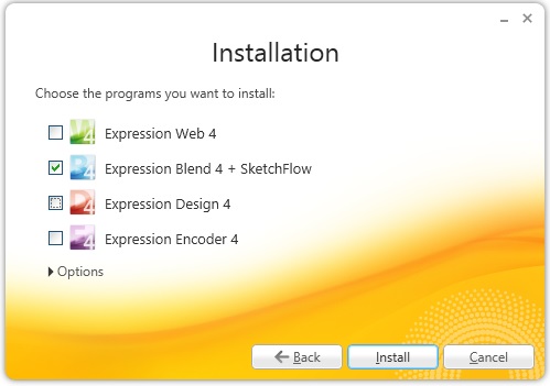
Ở một bài trước tôi có giới thiệu về về một công cụ giúp thiết kế giao diện cho WPF(Expression Studio), hôm nay chúng ta sẽ sử dụng nó. Trước tiên chúng ta cần tải về và cài đặt công cụ này tại đây, có nhiều tùy chọn trong bộ công cụ nhưng chúng ta chỉ cần Blend là đủ/cũng có thể cài full nếu cần thiết.
[code language="csharp"]
TJ2R3-WHW22-B848T-B78YJ-HHJWJ
6WDDQ-K7D4F-GQGF4-2VYBJ-8K6MB
6WDDQ-K7D4F-GQGF4-2VYBJ-8K6MB
6WDDQ-K7D4F-GQGF4-2VYBJ-8K6MB
YV688-DW39R-JPKH2-6DG4R-HM9JD
[/code]
Sau khi cài đặt xong chúng ta khởi chạy ứng dụng và tạo mới một Project WPF- trình tự như hình sau
[caption id="" align="aligncenter" width="350"]
 Step 01 - New project[/caption]
[caption id="" align="aligncenter" width="550"]
 Step 02 - Chọn WPF App[/caption]
[caption id="" align="aligncenter" width="783"]
 Step 03 - Sau khi tạo xong project, ta thêm CheckBox vào UI[/caption]
[caption id="" align="aligncenter" width="733"]
 Step 04 - Thêm 1 Eclip và 1 Rectangle[/caption]
[caption id="" align="aligncenter" width="314"]
 Step 05 - Tiến đăng ký Event-Trigger cho sự kiện IsChecked của CheckBox[/caption]
[caption id="" align="aligncenter" width="440"]
 Step 06 - Tạo kịch bản (Storyboard)[/caption]
Tại giao diện biên tập Storyboard chúng ta có biểu tượng Recording phía trên-phải sáng lên và thanh TimeLine, thanh Timeline lưu lại trạng thái của từng đối tượng cho các móc thời gian trên thước đo. Khi một thuộc tính nào đó của đối tượng thay đổi tại một cột thời gian kế tiếp thì hệ thống sẽ tự in dấu và lưu giữ bước biên tập hiện tại - thể hiện bằng dấu chấm trắng trên cột Time. Công việc của chúng ta là kéo cột Time màu vàng qua lần lược các cột timer, sau đó thực hiện thay đổi thuộc tính cho đối tượng đích và lập lại đến khi hết kịch bản.
[caption id="" align="aligncenter" width="544"]
 Step 07 - Giao diện Storyboard như trên[/caption]
[caption id="" align="aligncenter" width="689"]
 Step 08 - Xây dựn kịch bản[/caption]
Để khi kết thúc kịch bản, các đối tượng trở lại vị trí cũ ta Set property AutoReverse="True"
[caption id="" align="aligncenter" width="449"]
 Step 09 - Tắt chế độ biên tập và nhấn F5 để chạy ứng dụng[/caption]
Vậy là chúng ta có một kịch bản hoàn chỉnh như sau: Quả bóng tròn lăng sang phải khi CheckBox "Run" được Checked, khi quả bóng lăng đụng khối vuông, khối vuông biến thành tròn và bị văng đi một đoạn. Sau đó ta thấy kịch bản bị tua ngược lại vì thuộc tính AutoReverse="True".
Để Start một Storyboard đã được định nghĩa trong [Resource] ta có hai cách đó là [1]Start trong Triger hoặc [2]Start trong Code-behind, Cách một được dùng như tôi hướng dẫn ở trên, cách hai ta làm như sau
Định ra một Storyboard
[code language="xml"]
<Window x:Class="StackOverflow.MainWindow"
xmlns="http://schemas.microsoft.com/winfx/2006/xaml/presentation"
xmlns:x="http://schemas.microsoft.com/winfx/2006/xaml"
xmlns:local="clr-namespace:StackOverflow"
Title="MainWindow" Height="350" Width="525">
<Window.Resources>
<Storyboard x:Key="PlayAnimation" Storyboard.TargetProperty="(Canvas.Left)">
<DoubleAnimation From="0" To="100" Duration="0:0:1"/>
</Storyboard>
</Window.Resources>
<Canvas>
<Button x:Name="btn">Test</Button>
</Canvas>
</Window>
[/code]
Tìm và khởi động storyboard trên như sau đây
[code language="csharp"]
public partial class MainWindow : Window
{
public MainWindow()
{
InitializeComponent();
this.Loaded += new RoutedEventHandler(MainWindow_Loaded);
}
void MainWindow_Loaded(object sender, RoutedEventArgs e)
{
Storyboard sb = this.FindResource("PlayAnimation") as Storyboard;
//Không cần dòng dưới nếu trong XAML đã thể hiện điều này - Target
Storyboard.SetTarget(sb, this.btn);
// End Find
//Start
sb.Begin();
}
}
[/code]
Chúc các bạn vui vẻ!
Phạm Tuân
Đăng ký:
Nhận xét (Atom)